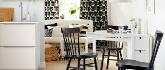
Light furniture colors
Light furniture is sold everywhere, is easily combined and fits almost any design and layout.
Advantages of a light set:
- Visually expands the space. When properly arranged, furniture will act as an additional element that expands the space.
- Large color palette. The variety of different shades is very large, everyone will find something to their liking.
- Ease of combination. Light furniture with other light shades can be either background or accent; just choose a sharper tone.
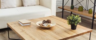
Light wood colors
Light wood, both natural and painted, is widespread on the market due to its affordability and large selection.
This is only a small part of the popular wood shades:
- Karelian birch. Golden color with dark marble pattern.
- Light ash. Similar to coffee with milk, with a slight golden tint.
- Acacia. Wood with a yellow, gray or greenish tint, with thin veins.
- Pine. It comes in several variations: white and pink or amber with a brown, smoky pattern.
- Beech. Beige-pink color with a light woody texture.
- Milk oak. Matte material with a pearly beige tint.
- Alder. Cool gray-pink wood.
- Apple tree. Bright amber color with pronounced veining.
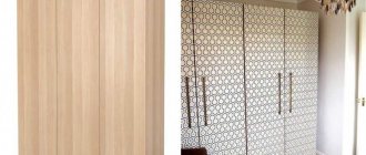
Exclusive furniture
- Tansau maple. Light wood with a yellow tint.
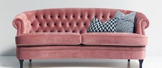
Light fabric colors
The pastel set is very popular in the market.
In the last decade, designers have learned to create stain-resistant fabric, so you don’t have to limit yourself in choosing light-colored upholstery.
The main samples from light fabrics:
- White-gray with a cool tone.
- Linen beige. It shimmers gold and looks like diluted cocoa.
- Silk gray. Grayish tint with a pronounced pearly tint.
- Bright skin. Warm sandy shade.
- Light beige. Pastel brown cool tone.
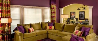
Light solid colors
In combination with bright elements or a play of textures, a monochromatic set will greatly demonstrate its potential.
Basic shades to maintain the overall palette:
- alabaster;
- white;
- beige sand;
- cream.
Several accent colors:
- blue;
- lime;
- pink flamingo;
- gray cashmere.
The colors from these two lists make interesting combinations when worked together.
Other useful tips
In order for an interior made up of sonoma-colored furniture to look harmonious, it is important to follow the recommendations of experienced designers on the placement of objects and the selection of a general color scheme.
Light furniture looks especially advantageous if it stands against a dark background. It should not be a bright spot, so its execution should be as simple as possible.
Light oak against a dark finish looks most advantageous Source allegroimg.com
The appearance of sets made of Sonoma-colored oak benefits from the presence of glass and mirror inserts. They provide a special play of light that can highlight the unusual texture of the base material.
The appearance of sets made of Sonoma-colored oak benefits from the presence of glass and mirror inserts. They provide a special play of light that can highlight the unusual texture of the base material.
Mirror inserts provide a special play of light Source mega-furniture21.rf
If the rooms are small, when equipping them it is better to give preference to narrow, light-colored furniture that has open shelves and racks. Then it will not clutter up the already cramped space.
The darker the room, the lighter the furniture should be, therefore, if the windows of the living room or bedroom face the north side, furniture made from light Sonoma oak is ideal for their equipment.
Light-colored sets make dark rooms brighter Source brw.gr
When it is necessary to indicate contrast, designers like to pair shades of chocolate-colored wood with light oak. This tandem makes the decor original and attractive from an aesthetic point of view.
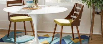
Intermediate
The intermediate palette includes universal shades, they are not too dark and not too light, they are easy to combine with bright elements.
Main intermediate colors:
- Cherry. Occurs from amber to reddish.
- Rustic oak. The oak is not as rich as usual, which is why it is considered intermediate.
- Alder. A tree with a rich red tint.
All transition colors have a warm tone, but with different saturation.
What children's furniture to choose?How to reupholster a sofa with your own hands: step-by-step instructions and photo examples
How to choose beautiful and fashionable armchairs for the living room: recommendations for selection
Sonoma oak shades
Many people think that Sonoma color looks exclusively like a light shade with a pinkish undertone. However, the common film for laminating chipboard displays only one aspect of Sonoma oak.
Inside this name are hidden light and dark shades: what natural wood will look like depends on age, humidity and other environmental factors.
Important! The older the tree gets, the darker the color the wood becomes.
Light
The palette from almost white to milky is typical for young trees. Shades of pearl, ivory, cream, silver look elegant, perfectly complement the interior, making it more sophisticated.
The photo shows the texture of light chipboard
Average
Also called Sonoma truffle oak. It goes well with its light “brother”, but also looks amazing on its own: the delicate texture of golden wood with dark, almost black veins attracts attention.
Dark
Dark tones are characteristic of European wood, as well as mature trees. Dark colors vary in intensity - from medium, slightly darker than truffle, reminiscent of Endgrain, to maximum shaded, more close to the color of wenge.
Rule for choosing a palette for furniture
When choosing a color, you should follow a couple of basic rules:
- Furniture should be lighter than the floor.
- The set should be darker than the walls.
- Do not combine more than three colors and five shades.
If you adhere to these principles, the end result will be balanced.
Successful color combinations in the interior of the apartment
You should start from the temperature. We don’t combine cool colors with warm ones and vice versa. Natural palettes will be the most comfortable for the city.
- Bright red, cornflower blue, lemon, lime - these are the colors that go with white, they will look different with different tones, so you shouldn’t make a big difference in your choice.
- Beige is the color that goes with brown. This universal combination is used everywhere: in the bedroom, living room, nursery and even in the design of the kitchen.
- What color goes best with white? This is black, and black also comes in colors that go with gold. This triple set always looks sophisticated and stylish in any design.
- Furniture in the interior is what you should start from initially; the walls, ceiling and door should complement the set and emphasize it, then the room will be pleasant on a psychological level.
Current combinations in the hall and hallway
Furniture in gray tones is a traditional option for furnishing the hall and corridor. However, this does not mean that they cannot be used in high-tech, modern or loft styles. The main thing here is to choose the right decor.
Gray furniture for the hallway and living room is appropriate only when it is possible to keep the walls and ceiling in the same color. Moreover, in such a situation it is recommended to use different half-tones of gray.