How to combine colors correctly
Try not to visually overload your city apartment with an abundance of shades. 3-4 colors look appropriate in the living room interior. The main tone should fill the room by 75%, another 25% will come from additional shades and 5% from bright accents. The use of additional decorative elements with different textures and rich colors will make the monochrome design of the room less boring. Try to use neutral colors as a general background.
The most appropriate combination of colors in the living room interior is from one color triad. The color wheel includes a combination of orange with violet and red, green with blue and cyan. According to designers, color combinations of the same tone in the living room interior are considered appropriate. Feel free to combine light yellow, dark yellow and yellow, etc. Using tones from the same palette, dilute them with neutral shades such as gray, beige and white.
If you don’t know which combination will be most suitable for the living room, then pay attention to neutral shades. White, black, gray and beige colors are considered universal. These tones can be safely combined with any others. If desired, take them as a basis and add additional shades.
What color of furniture to choose for the living room
One of the main questions when decorating the interior of a living room is what color to choose upholstered and cabinet furniture. Caution is needed here.
Set one or two colors as the main ones, no more. Shades of white, black, gray or beige can be auxiliary. Against the background of these neutral tones, the position of the main color combination will be more advantageous. Before deciding on a color, observe natural combinations: they are natural and harmonious and there is no need to invent incredible combinations, everything has already been created before us. The pair green and brown looks environmentally friendly - this combination is found everywhere in forests and fields, and the combination of yellow and purple is easy to see in blooming irises.
As you can see, this is a never-ending process! Photo galleries on the Internet can help you make your choice; look through albums with magnificent landscapes: sunrise in the mountains, the morning awakening of nature, magnificent sea beaches, alpine meadows with their various herbs, the winter silence of the forest. The view that has captured your imagination can be analyzed and the main shades you like selected. This picture can become the basis for further work on the interior. You can even print it and use it as a decorative element.
The living room, which is intended for holding celebrations with friends, should be decorated in bright and warm colors, for example, yellow and red. They have a stimulating and tonic effect, which means they can charge you with a cheerful mood. Shades of blue, purple and green contribute to a calm and comfortable holiday surrounded by family.
If your living room is intended for varied leisure, then perhaps beige decoration will be a godsend for you: it is a universal color and it is suitable for any design solutions. When the living room renovation is completed and the furniture is installed, feel free to add bright decorative items.
Selecting a color palette for living room design
The color and interior design of the living room can be absolutely anything - it all depends on your personal preferences. Try to choose the right shades to create the desired mood in the room. In addition to the neutral tones listed above, these four colors are often used in the interior:
- Green. By choosing it, you will be able to create an atmosphere of relaxation in the room and get rid of fatigue.
- Blue. This color has a good effect on sleep.
- Red. The shade indicates self-confidence and emphasizes the authority of the individual. If you want to make your living room less aggressive, then give preference to dusty pink or terracotta.
- Yellow. Brings a feeling of joy and happiness into the room, promotes self-development.
Having considered the characteristics of the main shades, it will be easier to make a decision in favor of one of them.
Basic furniture colors and their characteristics
There are only four main natural colors of furniture - dark, light, intermediate and multi-colored.
There is a special color combination table.
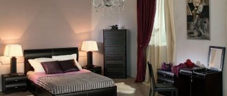
Dark natural colors and shades are most often used to recreate a classic, strictly interior with a touch of aristocracy. Furniture made in black tones creates a light atmosphere of luxury, sophistication and conciseness in the interior. It brings conservatism and respectability to bright interiors, calms and ennobles.
Rooms in dark colors look luxurious.
Lighter shades of furniture are a little more popular and more commonly used. This refreshes the room, gives it more freedom and visually enlarges the space. Snow-white interior items fit into any style, both historical and modern. Light shades are associated with practicality and at the same time luxury. They always look advantageous and attract many looks.
Light colors add coziness.
Neutral colors and shades are called intermediate. This emphasizes the lightness and tenderness of the interior. These are calm and sophisticated colors. They usually don't attract a lot of attention. They are distinguished by their practicality and great possibility of combinations.
If you don't know what color to choose, choose a neutral one.
Multi-colored includes all bright and flashy colors. These shades do not go unnoticed. More often than not, they give calm interiors their own special mood and refreshment. They are quite difficult to combine with many styles, but this does not make them lose popularity.
Bright rooms are not suitable for all people.
Pros and cons of light colors
The right color in the living room interior allows you to create the desired atmosphere. Light colors will bring notes of peace, freshness and cheerfulness to the room. It will be possible to get rid of emotional stress by decorating the walls in the room in this range.
Very cozy and homely light color of the walls in the living room in the photo
The main advantage of light colors: they can visually enlarge a small room. Even if there is not enough light in the living room, this palette will visually correct the situation. Light colors will be combined with any colors and textures, so they are very convenient to use. This color combination will create a trusting and calm atmosphere in the room.
The disadvantages of a light palette are the need for more thorough and frequent cleaning, since these tones are very easily soiled. It is imperative to dilute this range with other bright colors so that the room does not look dull.
What color of furniture to choose for the kitchen
What colors should your kitchen furniture be and what should you avoid? The designers' recommendations are as follows:
- For one kitchen set, it is enough to use one or two shades.
- When decorating in two colors, the shade of the upper tier should be lighter than the tone of the lower cabinets.
- A monochromatic design looks harmonious when using the following shades: from light beige to dark brown - they are calm and pleasing to the eye. It is better when a small kitchen is decorated in a single color.
- Of the several color options used in the manufacture of the headset, only one can prevail.
- The combination of colors in furniture must be clearly verified.
If you plan to purchase brightly colored furniture, then decorate the walls in calm, neutral tones. And, on the contrary, plain furniture looks good against a bright contrasting background.
Who suits dark tones?
Most often, this palette for the home is chosen by people who need tranquility and privacy. If you don't like warm and bright colors and you are constantly surrounded by people at work, then you need to choose a dark color scheme. With the right design approach, this palette can be used to enlarge a small room by adding mirrored surfaces.
The hall looks noble and tasteful in dark colors
Thanks to dark colors, it will be possible to create the most suitable interior for creative and romantic people. If you love antiquity, then feel free to choose this palette for the guest room. Most often, when decorating a room, brown, black, chocolate, burgundy and coffee with milk colors are used. When choosing a shade for the ceiling, exclude a dark palette, as it will visually reduce the space. Give preference to light and glossy surfaces.
Materials and textures
The most popular are glass and other glossy surfaces. Manufacturers of modern furniture products also often use:
- natural wood;
- stone;
- metal;
- high quality plastic.
For the manufacture of upholstery, genuine leather, its eco-friendly modification, some types of textiles, and suede are actively used. Tapestry is used less frequently and is more difficult to fit into a modern interior. Plain material without a pattern is used more often than multi-colored decorated material, with the exception of designer designer products. Photos of modular living room furniture in a modern style clearly reflect the successful combination of original design and functionality.
A variety of designs and shapes of living room cabinets, placement methods
The use of materials such as chipboard, MDF, plywood allows you to successfully reproduce the most common modern textures and at the same time save money. In recent years, furniture panels have also become widespread, which are characterized by increased strength, resistance to external influences, and a long service life.
Metal + natural wood Stone + glass
Chipboard
Genuine Leather
Suede
Interior color and style
Before you start renovating, think about not only the color, but also the style of the interior in which the living room will be decorated. These two nuances should be in maximum harmony with each other so that the room turns out natural and holistic. If you want to create an atmosphere of calm and complete tranquility, then when combining colors, choose black and white. Combining sunny and light colors is desirable for those who want to create a positive and cheerful atmosphere in the room.
The most common mistakes when choosing furniture color
The most common mistakes when choosing the color of furniture for any room is lowering the light level. Lighting transforms some colors and completely changes the visual image of the interior. White furniture can become dirty in certain light, black furniture will begin to depress and reduce the space even more. Therefore, if possible, it is better to examine the colors of furniture upholstery in natural daylight.
Take care of your furniture!
A large number of flowers in one room is also not welcome. It is better to adhere to the rule - no more than three shades for furniture per room. This will create color harmony and a great combination. In addition, an abundance of colors leads to visual chaos, and chaos leads to panic and irritation. But at the same time, you should not minimize the number of tones.
Furniture can be the same color as the wallpaper.
Monochrome looks beautiful only in cases where it is supported by a feature of the interior style. A disjointed interior with different types of furniture also looks unnatural and repulsive. It is better to follow one chosen style and match everything to it in appropriate shades.
After familiarizing yourself with the basic recommendations on what color is best to choose furniture, everyone will be able to create a beautiful, harmonious interior in their home.
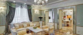
Classic: beauty and wealth
When decorating a living room in this style, try to avoid using bright colors. The best idea would be to choose calm, moderate colors. When buying curtains, give preference to drapes, curtains and curtains.
The best option would be garnet and emerald. Arrange the floor using wooden parquet; it can be made in cappuccino or wenge color.
Upholstered furniture upholstered in jacquard, velor and brocade will complement the classic interior. Cabinets made of mahogany and dark wood look best here. No room would be complete without a fireplace, candlesticks, columns and an antique clock.
The use of wallpaper with floral motifs and oriental patterns will make the room cozy. Choose gold decorative elements for the hall to make it look truly warm and expensive. Avoid too dark and bold tones. The use of mirrors in beautiful frames will make any room as spacious as possible.
Useful tips for choosing
Choosing furniture for a living room is a responsible matter. It is most reliable to purchase products from well-known, well-established salons. Before you settle on anything specific, you need to:
- Take measurements to accurately know the area of the room and determine the preferred dimensions of the product.
- Visually imagine the compatibility of a specific piece of furniture with other interior elements.
- Think over a comprehensive color concept.
- Select accessories that highlight the beauty of the purchased set.
The quality of living room furniture is of great importance. You should pay attention to the treatment of surfaces, joints and connections. The presence of chips, cracks and scratches should alert you. The maximum permissible load must also be taken into account. The paint layer must be even and smooth. The main requirement for any glass inserts is a material of increased strength. In addition to design, colors and shapes, you should pay attention to the functionality, reliability, safety and service life of furniture.
Decide on the preferred dimensions of the product Visually represent the compatibility of interior elements
Think over a comprehensive color concept
Select decorative elements
Modern styles
When you decide to decorate a room with modern motifs, think more carefully about what you want to see in your room. Depending on the style, the decoration of the hall will be slightly different. The following styles are considered the main modern trends:
- High tech. Black and white colors are used here, so using light green, orange and purple tones is unacceptable. Preference is given to modern built-in furniture.
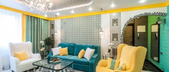
- Kitsch. Incorporate seemingly incompatible elements into your interior. Use colors in your design that will create an atmosphere of slight chaos. Pistachio, blue, green, mustard - all colors are appropriate here.
- Pop Art. Quite a shocking style that uses bold ideas. This living room looks most harmonious in warm colors. The walls are covered with various variations of peach, pink, yellow. Pop art posters complete the overall image of the room. The bright color of the curtains in the interior of this living room looks harmonious with unusual prints.
- Minimalism. The best choice would be beige, ash, white and brown. Choose furniture that is as laconic and simple as possible. Cushions on the sofa and tablecloth can be bright.
A good solution for creative and courageous individuals - kitsch style
Having considered all the features of each modern movement, it will be easier to choose a specific option.
Color combination in the apartment
If choosing the color of the walls to match the finishing of the floor and furniture according to the style is not a problem, then correctly combining tones in different rooms is a responsible matter. Incorrectly selected combinations will negatively affect a person’s perception, so here it is also worth adhering to some rules that will help you create a beautiful interior.
White walls and furniture in the living room
Combination of red color in the interior
Living room: colors for relaxation
The choice of finishing shade and harmonious combination with the color of the furniture sets the overall mood of the living room. Since this is where a person receives guests and relaxes, the walls should not be flashy. A few examples of a successful combination:
- furniture: a light soft sofa without armrests goes well with pale armchairs and chairs, but it is better to decorate a glass coffee table in black to create contrast. Dark gray shelves for books will not distract from the overall composition;
- finishing of the floor and walls: gray laminate with a wood pattern combines well with mustard light wallpaper;
- accessories: a black openwork chandelier looks great in the center of the room, and it is better to hang lamps around the perimeter and above the TV. The curtains can be made turquoise, and a round rug of the same color can be laid near the sofa.
Combination of purple flowers in the bedroom
Combining colors in the interior
If you are using a large-sized set, it is better to make it from light wood. For example, Sonoma oak in a light beige design would be an excellent option for a living room wall.
Combination of gray color in the interior
Warm colors make the bedroom cozy
Bedroom: how to design a sleeping area
Before choosing furniture in the bedroom according to the color of the floor or the color of the walls, it is worth remembering that this room is the place where a person relaxes after work. Here you can use calm colors, and if you decide to choose something dark, for example, wine color, then it must be combined with white accents.
Stylish, cozy and functional: decorating a bedroom in these shades sets the mood for relaxation
Beige, white and gold colors in a classic living room
A good option would be to use a shade of cocoa with milk. Fashion trends suggest purchasing a bed made of dark cherry and making the upholstery in beige. You can lay yellow laminate on the floor, and choose brown or coffee-colored wallpaper with a discreet ornament. The curtains here will be light brown, and the chandelier will be beige.
Color combination in the kitchen interior
Color combination in a retro interior
Hallway: a combination of contrasts
This room always lacks squares, so the unwritten rule for choosing colors is to use light colors. Cappuccino color in the hallway can only be used as an insert into furniture. A good technique is to use vertical stripes, which will also visually expand the space.
White walls and furniture in the interior
When choosing a finishing color, you should give preference to peach, beige or sand. If the hallway borders on a corridor, you can install a tall beech cabinet here that will accommodate all your outerwear. The floor must be made a tone lighter than the wallpaper. The front door should contrast with the overall design.
Colored bed in the interior
Combination of pastel colors in the interior
Children's room: choosing colors from a psychological point of view
You can combine different shades in the nursery together with your child. If the baby is already able to think logically, it is advisable to ask about his desires. The main principle will be the ban on the use of dark shades, as they will put pressure on the child’s psyche. Basic recommendations:
- The combination of white with lilac, yellow with blue, pink with sand, purple with light green looks impressive and interesting - such palettes lift the child’s mood;
- It is better to choose furniture that is functional and non-staining – white chairs will not do;
- if the room is for 2 children, a brightly decorated partition is made between the beds;
- a writing corner with a computer desk can be ordered from dark brown wood (pen marks will be less visible on it).
What is country music
You will be able to create rustic coziness and a romantic atmosphere in the living room by choosing this style. Particular attention is paid to the upholstery of the sofa, made from natural materials. The country style exudes a special warmth, as the decor uses crocheted runners, fresh flowers, a fireplace and antique furniture. When choosing shades for the walls, choose calm tones, because gold and luxury are of no use here.
Choose wallpaper with a pattern in the form of stripes or flowers. Stone or brickwork, as well as wooden panels on the walls, organically complement the country style. Lay parquet or stone tiles on the floor. A carpet of yellowish, greenish, turquoise or lilac color will complement the design.
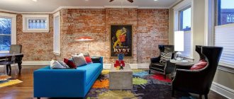
What should a loft be like?
The main feature of this style is the presence of brickwork. Bare concrete walls are allowed, as they best convey the attic atmosphere. It is important to decorate the room using light or dark paint. Olive, gray and brown tones would look appropriate in the living room. It is important to paint one of the walls in a burgundy, red or green shade.
The photo shows the interior of a living room in the loft style, which does not lose its relevance
Most often, lofts are arranged in large rooms where there are no partitions, as well as studio apartments. Here, feel free to combine old furniture with new ones. The presence of wooden beams on the ceiling, made of cedar, ash or other species, is best suited for this style. The ceiling surface can also be decorated in white. The floor can be covered with laminate or wooden boards.
Complete the living room with a sofa corner or a spacious bed. Good soft upholstery and plenty of pillows will allow you to recreate the desired atmosphere of comfort. Use short cotton curtains or blackout blinds.
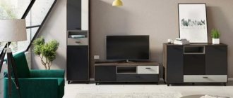
Design of current types of furniture
The choice of furniture design depends on individual preferences, as well as the style in which the interior is decorated. Those who doubt their own taste are better off choosing the timeless classic in its updated interpretation.
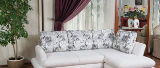
Sofas
Upholstered furniture for the living room is mainly modular models. They are compact, do not take up much space, and are easy to dismantle and carry. Furniture options with an ottoman are popular - they can enliven glamor and pop art interiors and are suitable for small rooms. U-shaped solutions also remain relevant; this is an indispensable option for spacious rooms, the ability to use a free center. Popular modifications of the design are the classic book, as well as its European version.
Modern sofas are furniture for the living room in a minimalist style, mainly with a transformation mechanism. There are two options for geometry - clear, laconic lines (European, mainly Italian products) or, conversely, emphasized softness to create an atmosphere of relaxation. Popular design variations are a classic leather sofa with strict straight lines or a textile-upholstered model with a smooth, streamlined shape.
Walls
A modern wall unit is a modular design consisting of several parts and used for storing things instead of a closet or chest of drawers. Sections usually mean drawers and glazed shelves, located one above the other in horizontal tiers. Some models have a compartment for dishes in the living room. The main advantages of use are large capacity and ease of installation.
For such furniture in a modern style living room, two design options are used - with completely closed or partially open sections. The first type is preferable, since less dust accumulates behind closed facades.
Popular design modifications are with or without a glazed module. Design variations - a horizontally oriented furniture set that stretches along the entire long wall, or a vertically elongated pencil case for small rooms.
If the room is narrow, it is better to abandon the wall for the living room. A compact, functional wardrobe or chest of drawers would be preferable; they do not take up much free space.
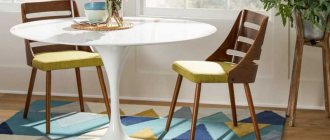
Tables and chairs
Among the many varieties of compact coffee tables, the most popular options are square, round, and rectangular models. Common design modifications are with and without wheels. Design variations - folding, sliding.
If the room is used for eating, you can choose a classic oval or rectangular table. Suitable furniture for a small living room is a compact folding structure on wheels, consisting of two tiers. Chair options include classic wooden chairs with a rectangular or oval back, folding chairs (good for children), and high bar chairs.
Requirements for wine cabinets, dimensions and furniture design options
Dressers and nightstands
Chests of drawers and cabinets in living rooms are vertically (horizontally) oriented modular structures designed for storing things. They come with drawers or hinged doors and several compartments. Popular options used in modern styles:
- compact corner furniture;
- square models with high legs;
- built into the wall;
- combined with a fireplace (electric).
Common modifications are a quadrangular block with an L-shaped structure attached to the side (for example, furniture for a TV), a bedside table without drawers with a small chest of drawers adjacent to it. Interesting design variations - with glass inserts, wood carvings or metal decor.
A popular option for a TV stand is a horizontally elongated model with drawers. Also in modern homes you can often find three-leaf TV furniture, where the center is slightly lowered down, and the side fragments, on the contrary, are raised.
Corner furniture with high legs
Built into the wall
Combined with fireplace
Transformers
Various types of transformable furniture are often used for the living room. They are compact and functional, especially suitable for placement in small rooms. Recommended options:
- The bed combined with a corner wardrobe is a modular design with a horizontally extendable bed. Convenient, but the transformation mechanism often breaks down.
- Sofa with an additional upper tier. It can sleep three adults or four children. A functional and ergonomic product is not suitable for a narrow room.
- A reclining chair that folds horizontally. Such furniture helps save space, but it is uncomfortable to lie on.
The features of the models used in the new styles are smooth, streamlined shapes without sharp corners and an active combination of different textures in one design. Popular modifications:
- a vertically oriented transformer that folds out or is equipped with a retractable mechanism;
- table with an expanding tabletop;
- chair with adjustable backrest position.
The main design variations are modern classics (compact minimalist furniture with laconic, clear lines), large-sized sets of several modules.
Bed combined with corner wardrobe
Sofa with additional upper tier
Reclining chair
Table with expanding top
Poufs and armchairs
In modern living room interiors, poufs often serve as bright accents. The most fashionable types of chairs are a rocking chair, a chaise longue, and a sphere that resembles a hollow ball inside. The latter option helps create a cozy atmosphere in the room.
Armchairs are most often used in tandem with a sofa (coffee table), provided that all three pieces of furniture are decorated in the same style. However, a free-standing, interesting model can also significantly enliven the interior. The most popular of them:
- Recliners (backrest position may vary).
- Suspended (fixed on a cross fixed to the floor).
- Egg (ball modification).
- Papasan (does not have a pronounced back, its shape resembles a disk with a recess inside).
Reasons for the popularity of wall cabinets for the living room, their varieties
Interesting and modern design options for poufs - cylindrical, cone widened at the bottom, spherical. Features of the models used in new styles are a tendency to repeat the shape of the body of a seated person (anatomical design). The most popular modifications are spherical or ellipsoidal, of any streamlined shape. Design variations - bright design in the style of glamor and pop art or, conversely, styling as country furniture made from natural materials, for example, wicker chairs.
You shouldn’t give up on a chair or pouf if the color of the upholstery doesn’t fit into the overall scheme of the interior; you can easily solve the problem by covering the upholstered furniture with textiles of a suitable shade.
Recliners Hanging chairs Egg Papasan Cylindrical pouf Cone Spherical
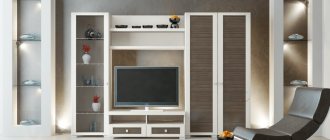
What is remarkable about the Scandinavian style
Even in a Khrushchev-era building you can arrange a neat living room in Scandinavian motifs. The main base color here is white, it is often complemented by wood laminate in light shades. You won’t be able to find multi-colored decorative elements here, since the paintings and textiles are made in subdued colors. On the one hand, the Scandinavian style represents the characteristics of the northern people, and on the other hand, it is very similar to minimalism. These two combinations make the living room truly unusual.
There are no large closets in the room; shelves that are not filled with things are welcome. The sofa and armchairs are made in milky or gray color; they are quite low here. The chest of drawers and sideboard perfectly complement the overall look of the room.
About additional design elements
It is believed that floors in light colors are so universal that they can be used with any other colors. However, it is important that there is a noticeable contrast in the room.
The perfect combination of a couple of bright accents with an overall neutral finish on the floor, walls and ceiling
Bedroom interior in pastel colors, diluted with olive textiles
You can achieve 100% harmony in an interior where light colors predominate using the tips below:
- You should approach the choice of fittings responsibly - the furniture should never merge with the walls.
- Dark shades are a must, but not going overboard with their abundance is also important for the mood of the apartment.
- It is appropriate to use decorative pillows or blankets with patterns, bright frames, and vases.
Bright accents of turquoise shades in the interior of a gray living room
Light-colored floors are part of a classic interior that is constantly evolving and acquiring new features. Neoclassicism has contrasting minimalism, stylish laconicism and is widespread. Thanks to these qualities, light-colored floors are also one of the most popular design solutions.
Glossy floor in a spacious classic-style bathroom
Light laminate flooring in a Scandinavian style living room
Wooden plank floor in a Provence style kitchen
See also: DIY plasterboard arches for the hall: photos and detailed instructions
Advantages of Provence
The decor of the living room uses only light colors, the darkest of which is wood shade. The colors most often used here are pistachio, pink, wheat, beige, milky and blue. This coloring gives the room an atmosphere of relaxation and comfort. The main feature of Provence is modesty, which is carefully combined with luxury.
5 A Provence style room looks very airy and gentle
In this style, both when decorating the hallway and the hall, a floral theme, an abundance of sunny colors and retro shades are welcome. The room is complemented by cabinet furniture made in light colors, with small elements of wear. It is rare to find corner furniture in an interior; it is placed not along the walls, but throughout the room. The curtains are selected in a white shade with ruffles. Furniture upholstery is made from linen, chintz or cotton.
Combination of light floors with the rest of the interior
White walls and a light floor in the interior are acceptable only if the shades do not merge with each other. The thing to remember here is that white is not always solid and is available in different tones.
Light floors go well with both dark and light wall decoration
There are several rules according to which you can decorate walls under a light floor. Any of three options will be effective:
- The floor or walls have patterns, patterns, or areas of a different color.
- The walls are darker or lighter than the flooring.
- Light floor of a different texture (for example, wood + paint).
The baseboard to match the floor merges with the floor covering and creates the effect of continuing the floor, without focusing on the division of the interior
The dark baseboard clearly divides the space of the room
If dark covering options make the apartment more comfortable and serious, then a room in light colors always looks updated and dispels routine. Modern design actively uses the game of contrasts and monochrome surfaces. In this regard, shades of white and their combination are actively used in modern and new classic styles.
An entrance hall in a classic style with white interior doors and a glossy ceramic floor with an interesting decor “like a carpet”
However, all this does not mean that a room with a light design is not at all comfortable. The final impression largely depends on other interior items, which include fittings, decorations, and doors.
If there are dark doors in an interior with a light floor covering, then the room will contrast greatly. In such a room you can use furniture in both dark and light colors. Don't be afraid to use rich dark doors and white for the walls, as this will give the room a very organic look.
Black doors go well with beige or light brown flooring
A successful combination of a light brown solid wood door with a coffee-au-lait floor
To find out more about this, we suggest studying the table “How to combine light floors in the interior”:
| Light floor and ceiling + | Result |
| White furniture | Tenderness, airiness |
| Dark furniture | Effectiveness, contrast |
| Dark skirting boards | Geometry, rigor |
| Skirting in light colors | Spaciousness, harmony |
| Light walls | Unlimitedness, ease |
| Darker wall coverings | Visually higher room |
Dark walls highlight light floors
See also Gray laminate in the interior photo
Shades and prints of textiles in the living room
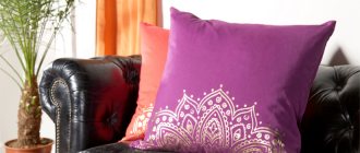
Try to match the color of the walls with furniture upholstery and textiles in the most suitable range so as not to spoil the overall impression. Find out how much the curtains, blankets and pillows you like cost to stay within your budget. Remember that pillows should serve as a light, bright accent. In interiors such as kitsch and pop art, you can experiment and choose textiles with leopard print.
When arranging a monochrome interior, which is decorated in the colors of one shadow row, use pillows with large patterns. Don’t be afraid to play with shades, choose materials with different textures: it could be coarse weaving or silk.
Try to complement your living room with decor with different patterns. These can be geometric designs, an unusual ornament, a classic monogram. Various patterns will look best against a light background. Pillows with bright patterns, chosen in the same style, will look beautiful on a white sofa.
Take a closer look at all the new designs in the field to make it easier for you to make your choice. Try to choose colors and interior styles for your living room that will best suit your personality and tastes. If desired, make small adjustments to the design of the room, for example, a small couch or lounger will look appropriate in the loft style.
Each interior has its own color palette (ranging from white to lingonberry and sea shades). The living room will not look tasteless if you try not to clutter the space with an abundance of colors and decor. Use a base tone and complement it with other colors that suit each specific occasion.
Choosing the color of the walls in the living room: more than 30 interior options
We will send the material by email
- Recommendations for choosing colors for decorating a living room Choosing the color of the walls in the living room, beautiful combinations, the best colors for the living room Cool colors for the ideal interior Warm colors for the ideal interior General rules for combining colors in interiors Suggestion
Choosing the right wall color for your living room is not as easy as it might seem. The choice of pallet is made taking into account many factors. The shade should not be boring, fit well with its neighbors, and blend well into the interior of the room. Let's try to understand the many nuances using specific examples.
Recommendations for choosing colors for decorating a living room
The choice of wall color in the living room should be based not only on the owner’s personal preferences, but also on the basic principles of combining shades. The wrong choice will lead to internal dissonance and, perhaps, even mental discomfort. When creating a project, follow the guidelines below:
- Use color schemes with similar shades. For example: green, light green, dark green. Dilute the palette with neutral shades: gray, white, beige. Use options that are in harmony with each other. For example, take a universal color (gray, white, beige, black) and dilute them with bright contrasts. When using a contrasting combination, it is necessary to take into account the palette of color combinations in the interior. The following options combine perfectly: yellow with purple, orange with blue, green with red. An important nuance in this situation is the proportional amount. The presence of one of the contrasts must be dominant. Apply adjacent colors. In the tonal spectrum, these would be blues and blues, oranges and reds or purples.
In addition to the rules for color combinations, you should follow the requirements for interior design:
- Add more than 3-4 colors to the interior of one room. One tone is used as a base, which should be a neighboring tone, the so-called comrade. The rest are used as additional colors. Apply color application percentage. The main background should be 70%, 25% - its “companions” and 5% of the lightest shades. Only neutral shades are chosen as the background. Monochrome design may seem boring. “Renaissance” occurs due to the bright interior.
Useful! The decor according to Eastern Feng Shui divides the living room according to the principle of masculine and feminine origin. The first group includes light warm shades, the second - darker, deeper options.
Choosing the color of the walls in the living room: beautiful combinations, the best colors for the living room
The choice of living room color depends on many factors, from the style used to the location of the room in relation to the cardinal directions. In addition, a number of other factors affect the cost:
- Room area. Quality of artificial and natural lighting. Owner's preferences. Practical requirements.
Useful! When choosing colors for your living room interior design, you can use the Itten color wheel. If you understand its principles, you can make it your main design tool.
It is recommended to decorate small living rooms in light colors. With their help, a visual increase in space is achieved. A good solution would be to add additional decoration to one of the walls. For larger spaces, there are more drink design options. Background color – plain or contrasting.
Windows in the living room, “looking” at one side of the world, have a significant impact on the interior of the living room. The saturation of sunlight or its absence affects the choice of color:
- For a “northern” living room, it is advisable to use soft, warm tones. They will make up for the lack of sunlight. Shades of yellow, green, beige and chocolate are an excellent solution. “Southern” halls are often decorated in cool colors. A good solution would be shades of blue, turquoise and white. Windows facing east are the first to greet the rays of the rising sun. To enhance the effect, choose warm light shades (pale pink, chalky, peach). Western living rooms are designed in cool colors (shades of blue, mint, neutral gray).
The right color for the walls in the living room performs several functions at once:
- Reduces or increases the area of the room. Highlights the desired areas. It “cools” or “warms” the space. “Shifts” or “narrows” the walls in the living room. Increases the height of ceilings. This will give your salon depth and volume.
Useful! Darkness or saturation produces the opposite impression. and can make a room look completely different.
Cool colors for the perfect interior
Cool color can play the role of primary or secondary, depending on specific decisions. It covers the following areas:
- Silver. Associated with cold winter. Ideal for those who prefer this time of year. Warm notes are added by combinations of yellow and green decorative elements. Blue. A rich tone that evokes elegance, energy and added vitality. To soften (domesticate) the interior is diluted with less saturated tones. Pairs perfectly with white. Blue. It evokes associations similar to the color blue, sea and sky. Lilac. Associated with blossoming buds. Depending on the neighbor, it can be perceived as cold or warm. The interior of the living room, in which she plays the dominant role, looks impressive and amazes with its style. Looks great in symbiosis with gray, white and beige. Green. Depending on the shade it produces a different impression. The bright contrast will fill you with energy, give you strength and vigor. Muted, calm green color gives a feeling of loneliness, reminiscent of the warmth of summer. When using a green background, you should pay more attention to the selection of related colors. Sharp contrasts are not allowed.