How to choose colors for the interior using tables?
Colors in the interior have many abilities, the main of which is to create comfort and a favorable atmosphere for people. But the color scheme in the room can also expand or narrow the space. That is why you should be responsible in choosing colors for the interior and their combination. A table of color combinations in the interior, where perfectly combined colors are connected by lines, will be an excellent assistant in this regard.
How to correctly combine colors in the interior?
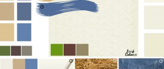
Many people wonder how to use the color combination table in the interior? Sometimes it is difficult and not entirely convenient. Below are tables of color combinations in an accessible and understandable form, where all popular shades are described. The trendy color is the main one, followed by colors that match it, which can be safely combined. An accent color will add brightness and creativity to the interior.
This table will tell you not only about the correct combination of colors in the interior, but also inform you about the meanings of some colors.
| Main color | Combines with flowers | Doesn't match with flowers | Psychology and influence of color |
| Grey | Blue, pink, brown, yellow, red, black, blue, lilac | Green, orange | Gives the room despondency and sadness |
| Lilac | Grey, chestnut, light purple | Red, orange, yellow, brown, black | Mystical, mysterious and mysterious interior |
| Violet | Light green, golden, orange, yellow | Dark green, brown, gray, red | Allows a person to calm down and find harmony of soul. Purple is the color of wisdom and inspiration |
| Pink | Brown, gray, burgundy | Yellow, orange, black | Romantic interior |
| Brown | Golden, grey, beige, pink, yellow | Chestnut, burgundy, lilac | Causes depression when spending a long time in an interior with a predominance of brown color |
| Blue | Red, grey, burgundy, gold | Green, lilac, brown | Makes the room cool, sometimes uncomfortable |
| Blue | Red, orange, blue, light purple | Golden, yellow, burgundy | Makes the interior cold; if the color blue is too much, scandals occur more often in the room |
| Green | Red, black, burgundy, yellow, orange | Grey, purple, blue | Has a calming and relaxing effect |
| Yellow | Grey, purple, brown, green, black | Lilac, blue, burgundy, pink | The illusion of sunlight, yellow color gives good mood and cheerfulness |
| Red | Blue, green, grey, gold, yellow, black | Purple, chestnut, brown | Uplifts the mood, keeps you relaxed, suitable for passionate people |
| White | Combines with any colors and their shades, as it contains all color spectrums | There are none | Instills a feeling of superiority, makes the room cold |
| Black | Red, grey, white, yellow, green | Pink, lilac, beige | Narrows the space, instills fear in a person, makes the interior mysterious |
How do colors combine in the interior?
The general combination of colors is presented in the tables above; now it’s time to talk about the most popular colors and how to combine them correctly in the interior.
Important! White color goes perfectly with any color, so it can be safely woven into any interior color scheme.
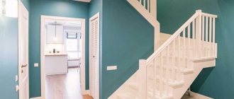
What color goes with gray?
Gray color has a rich hue. Many people mistakenly consider it faded and boring, because in the photo below you can see how noble the interior looks in gray, especially in combination with splashes of bright colors.
So what color goes with gray in the interior? The answer is simple - any, but the most commonly used colors are:
- Blue
- Pink
- Brown and beige
- Yellow
- Red
- Black
- Blue
- Lilac
The versatility of gray and its many shades makes it possible to implement any bright and creative design idea. Moreover, gray color slightly mutes bright and acidic colors, so with the help of this color you can easily correct a room that is too colorful. More photos of gray in the interior.
What color goes with brown in the interior?
The brown color in the interior must be diluted with lighter shades so as not to create a feeling of gloom. Brown with its beautiful shades (cinnamon, chocolate, coffee, caramel, camel) looks very noble and adds warmth and comfort to the room, symbolizing reliability, devotion and stability.
The main colors that harmonize with brown are the following:
- Golden
- Grey
- Pink
- Yellow
- Beige
- Burgundy and red
- Mint and pastel blue
More photos of brown in the interior.
What color goes with beige in the interior?
Beige color is both a cold and warm shade, which is why it owes its versatility. This color acquired cold notes from white, and warm notes from golden brown. This light color makes the interior light and calm, adding home comfort due to the naturalness of the shade.
So what color goes with beige? Beige goes well with many shades, among which are the following:
- Brown with all its shades
- Gold and bronze
- Yellow
- Pastel and bright blue
- Green and olive
- Lilac
- Red
- Turquoise and mint
More photos of beige in the interior.
What color goes with peach in the interior?
Peach color is a soft and delicate combination of yellow and pink shades. This color gives the room coziness, warmth, peace and security. The rich color of peach brings a festive mood to the home, while muted and pastel peach is calming and peaceful.
You can make the interior colder by combining pale peach with light pink shades, and peach and orange will make the room warmer. The following colors can be called the most suitable for peach in the interior:
- Brown with all its warm and cool shades
- Beige and yellow
- Pink
- Orange
- Turquoise and mint
- Blue and cyan
- Purple and lilac
- Green
What color goes with orange in the interior?
Orange color is one of the brightest and warmest colors in the interior. Even when combining it with other colors, it will not lose its richness and warmth. Orange color energizes and invigorates perfectly, so the ideal option would be to design the kitchen in orange tones, because every cheerful morning begins with this room.
The most successful combination of orange is its combination with white. This combination will be the sunniest and most energetic; moreover, this color scheme will help expand the room, which is beneficial for the kitchen and bathroom.
Advice! Orange color can be used to highlight some small decorative items. For example, you can put an orange ottoman, which will make the room look brighter and more cheerful.
The following shades go well with the radiant orange color in the interior:
- Grey
- Brown with all its shades
- White
- Red and cherry
- Blue and pastel blue
- Delicate shades of green
- Yellow
- Mint and turquoise
More photos of orange in the interior.
Do not confuse orange with terracotta, which is a mixture of red and brown in different concentrations. Terra, which is a calmer and more comfortable color, is more difficult to combine. If you still decide to contact him, then forget about artificial chemical colors and pay attention to more natural ones, the same applies to the furnishing of the room; terracotta color goes well with folk styles. Colors that will suit you: calm green or light green, lilac, blue, blue, all shades of red and brown, coffee colors (coffee with milk, cappuccino).
What color goes with purple in the interior?
Violet is a cool color of wisdom and calmness, which has light mystical notes. Scientists have also proven that the color purple has the ability to calm and pacify.
The color purple has many shades, the most popular of which are mystical dark purple, natural lavender and delicate lilac.
Purple color gives the room a noble and luxurious look, combining well with the following colors:
- White
- Gold
- Black
- Red
- Turquoise and mint
- Crimson
- Blue and cyan
- Beige and orange
- Natural yellow (egg yolk color)
- Light green
Photo of purple in the interior:
What color goes with green in the interior?
Green color suits absolutely any room and symbolizes peace. All warm and cold shades of green bring with them a good mood, a feeling of comfort and tranquility.
Green is a rich color and that is why it is considered the most difficult color to combine.
The best solution would be to combine the shades of cheerful green themselves. For example, pistachio and lime can be added to the main emerald color, which will dilute the cold color of the gemstone.
The following colors are considered the most suitable for green:
- White
- Black and brown
- Yellow
- Orange
- Gold and bronze
- Red and burgundy
- Blue and cyan
- Turquoise and mint
- Grey
Photo of green in the interior:
What color goes with lilac in the interior?
The lilac color is distinguished by its colossal tenderness and lightness and most often appeals to delicate and creative people. With the help of lilac, you can create a mysterious and mystical interior in cold colors. Such an environment is very relaxing and puts the mind into some kind of trance, which is why many avoid this color.
Most often, lilac is used in pastel colors, which look impressively delicate, as can be seen in the photo below. So the most suitable lilac colors include the following:
- Gray and silver
- White
- Black and brown
- Beige and yellow
- Golden and carrot
- Blue and sky blue
- Turquoise and mint
- Dark purple
- Fuchsia
- Delicate shades of green
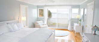
What color goes with blue in the interior?
Blue color is used to create a delicate, light and airy interior in cool colors. Even in combination with warm colors, a room in blue will not lose its cool note and freshness.
The combination of blue and white is very popular. This combination perfectly expands the space and makes the room unusually light and delicate. Most often this color is used in bathrooms.
Advice! In order not to lose the lightness and airiness of the blue and white combination, you should not add accenting bright colors, especially warm ones.
The following colors can be called harmonious with blue:
- White
- Yellow brown and beige
- green and turquoise
- Blue and mint
- Orange
- Raspberry and lilac
- Pink
Watch the video
This video lesson will show you how to correctly combine colors in the interior.
For children's
There is a strict distinction here based on the child’s age, as well as his gender. In the first three years of a child’s life, the child should be surrounded by wallpaper in pastel shades. Annoying colors are not allowed. In the period from three to 6 years, a child needs vivid impressions and emotions. You can choose the brightest ones.
Bright highlight of the kitchen
There is one nuance in the images. They don't have to be very big. Large figures can frighten a child. The same applies to geometric shapes with sharp corners. The presence of a composition with these elements can cause anxiety in a child. And pastel colors won’t help here. As the child grows up, you can use quite adult shades, turning the children's room into a teenager's relaxation room.
For the little comic book lover
If with boys everything is approximately clear, then with girls everything is a little more complicated . They prefer colors from the warm part of the spectrum. If possible you should use:
- pink;
- peach;
- soft green;
- warm yellow wallpaper.
For boys the situation is the opposite. It is better for them to make a room with blue or gray wallpaper. A combination of yellow and green, gray and orange is welcome. You can use red and brown finishing materials.
Completely red wallpaper should not be used for a children's room. When children of different sexes live in the same room, it is important to distinguish zones. Each zone should have its own color or texture. Even if the child has become quite an adult, it is not at all necessary to decorate the room in black tones. A large amount of black can make you sad. There's no need to talk about children.
An original solution for those who like to draw
How to choose the color of curtains to match the interior?
The choice of curtain color is of great importance for the interior. Using this attribute, you can expand or narrow the space, you can get rid of excess sunlight or add radiance to the room.
Important! Bright and warm colors help add light, while cool tones in curtains will make the room feel calmer and darker.
What to combine curtains with in the interior?
There are no strict rules or restrictions regarding the choice of curtains. They may not be combined with anything at all, or, on the contrary, they may completely merge with the interior. The tips presented below will help you decide on the choice of curtain color for your interior.
- Economical selection promises to choose the color of curtains to match the color of the furniture. After all, you can change the interior of your apartment without resorting to wall decoration. You can simply change the furniture and curtains and voila - a new interior solution is ready.
- Curtains that match the color of the walls can sometimes blend into the background. Here, for monotonous walls, it is better to choose curtains with an ornament, and for patterned walls, it is better to choose curtains without a pattern, although this rule does not always work.
- The current version of the selection of curtain colors states that you can match the color of the curtains to the color of the largest item in the room’s interior. For example, you can combine the color of the curtains in the bedroom with the color of the bedspread.
- Neutral selection of curtain colors (sand, beige, cream) will always be relevant, especially if the interior is designed independently.
- Color bunch - a technique where the pattern on monotonous curtains echoes other decorative elements.
- Window in the foreground. This option for decorating a room involves focusing attention on the window and curtains; here you should choose bright and non-plain curtains.
- Monochrome design. Here the curtains should be as close in tone to the color of the room as possible. It is not necessary to choose a color that completely blends with the walls; you can take a different shade of the same color or add a little ornament.
Tips and tricks
- The minimalist style in a room can always be diluted with floral curtains, but the main thing is not to overdo it.
- Small rooms should be equipped with small curtains with a minimum amount of ornament and pattern.
- Complex textured curtains are only relevant for large rooms.
- The brighter the color of the walls, the calmer the curtains should be.
- Playing with contrast will make the room interesting. For example, beige curtains will suit brown walls.
- The simpler and smaller the curtain, the more expensive the fabric from which it is made should look.
Watch the video
In this video you can see many interesting ideas and combinations of curtains with the interior.
Style selection
Classical
The classic style is distinguished by its restraint. Provided that orange is a very bright and saturated color, it should be accompanied by furniture of simple lines and interior details in calm shades.
The photo shows a living room with bright walls. Mirrors visually expand the area of the room by reflecting natural light.
For small rooms, you should choose a light orange shade. The brighter or darker the color of the walls, the smaller the area appears.
Modern
The modern style is characterized by functionality, the interior is dominated by straight lines, and the walls are a single color. One of the walls can be highlighted with a bright color.
The photo shows a spacious living room combined with a kitchen. A bright wall unifies the space, and pieces of furniture define zones.
Country
Country style involves the maximum use of natural materials. The interior uses a lot of wood and greenery. In contrast to the modern style, all kinds of cozy carpets, bedspreads and pillows are welcome.
Loft
Loft is a trendy and modern trend that is often used to create a stylish home. Orange color looks harmonious with the terracotta shade of brick and cold concrete. When using orange color, the interior softens and does not look so rough.
How to choose the color of the floor in the apartment?
A lot depends on the choice of floor color, because the play of colors and light can distort different shades and make the room visually larger or smaller, darker or lighter.
Below are several floor color options with a detailed description of all the effects each shade has.
- White floor will add brightness to the room and symbolize conciseness and purity. Most often, floor coverings of this color are used in small and dark rooms in a minimalist style.
- Gray floor makes the room calm and noble, but it must be very carefully combined with other colors in the interior. It is important to remember that a gray floor goes best with black and white interiors, as well as yellow.
- Yellow and beige floor the interior will add warmth and comfort to the room. This is the most versatile floor color that matches any type of interior.
- Orange and red floor makes the room bright and warm, but it is important to remember that this color is highly reflected and transferred to other surfaces in the room. Therefore, it is worth maintaining a warm tone in the interior of the entire room.
- Brown floor embodies confidence, stability and security. The only disadvantage of a floor covering of this color is the absorption of a large amount of color. But in general, this floor is universal for any interior, especially in country style.
- Black floor in the interior it creates an aura of wealth and mysticism. It must be used very carefully, especially in combination with bright colors. Black flooring is most often used in modern interiors and very rarely in classic ones.
How to choose the color of the laminate to match the interior?
Laminate has a wide range of colors and different patterns. You can choose a board that looks like wood, or you can make a stone floor using boards with this pattern.
Laminate flooring can look very strict and noble, or it can give the room a playful country style. Below are several laminate options with a description of all the effects they have on your dream apartment.
- White and gray laminate Most often used in apartments where the style of minimalism or Provence predominates. Rustic simplicity prevails here, which is perfectly complemented by laminate flooring.
- Light wood laminate Great for rooms with windows facing north. This floor finish will add warmth and tranquility to the room, suitable for any type of interior.
- Brown and red laminate adds warmth to the room and is perfect for interiors in autumn colors. But it is important that the room is abundantly illuminated, because dark floors take away light. These floor colors are very relevant in Gothic and Baroque styles.
- Black laminate gives the room a magical mystique. To prevent such a coating from absorbing too much color, it is most often combined with white walls. The styles of minimalism, high-tech and modern are simply unthinkable without such luxurious and elegant contrasts. Glossy black laminate will prevent strong light absorption, but will add charm and luxury to the room.
Watch the video
This video shows several beautiful options and examples of floor and door color combinations.
Types of wallpaper
Liquid
Wallpaper, different from the usual type, is a loose mixture that is diluted with water and applied to the walls like plaster. The result of the work is a smooth surface without joints. Visually, the coating is similar to plaster and has a textured surface.
The photo shows a country style kitchen with orange wall decoration.
Photo wallpaper
Wallpaper with photo printing is an effective solution for interior decoration. Realistic or abstract images will highlight the design features and also make it brighter. In addition, photo wallpaper can help increase the space, for this you need to use images with perspective.
Non-woven
Wallpaper can be divided into two types, those that consist entirely of non-woven material and those that have a base made of this material. The first type is most often used for painting due to its textured surface. The second type has only a non-woven base, the top layer consists of another material: vinyl, paper or textile.
Vinyl
The material is a two-layer fabric. The top one is vinyl covering, the bottom one is non-woven or paper. Vinyl coverings have a wide variety of colors and textures, and can also imitate other surfaces. The material is strong, durable and moisture resistant.
Paper
Eco-friendly, inexpensive and beautiful material, but not the most practical. Paper sheets absorb odors well, can fade in the sun and are not durable. It is also almost impossible to clean paper wallpaper from dirt without damaging it.
The photo shows a dining room in a classic style. The decoration is made with white wood panels and wallpaper with a red floral print in a horizontal way.
Textile
A beautiful and expensive way of finishing. Textile wallpaper has a breathable surface, which minimizes the risk of mold and moisture accumulation. The textile coating also has high heat and sound insulation rates. One of the disadvantages of the material is that they attract dust, with the exception of linen fabric, it is protected by antistatic impregnation.
How to choose the color of doors in an apartment?
Interior doors should delimit the interior space, and they should do this harmoniously. It is a very difficult question about choosing the color of doors if all the rooms are made in different colors, but for all problems you can find solutions that are listed below.
- Neutral door The natural color of the wood will suit any interior and will not disrupt the integrity of either the corridor or individual rooms.
- White door Perfect for a modern interior, because white color goes well with any color combination. This door is also universal for any repair.
- Dark or light doors in cool shades perfectly complement the minimalist style in modern interiors.
- Dark wood doors They look great in modern interiors and bring fashionable contrast and richness to the apartment.
- Artificially aged white doors are perfect for apartments decorated in country and Provence style.
- Choosing doors to match the floor color - a controversial issue. It’s good if the floors are the same throughout the apartment, but what if not? You can always find a general optimal solution, for example, doors that are several shades lighter. You can also decorate the doorway in the same color as the baseboards, which will give the effect of integrity.
- Choosing a door color to match the color of the furniture. You can easily make the doors resonate not with the floor and walls, but with the furniture. for example, if the room has dark furniture, then you can safely install dark doors against the background of light walls.
- Doors to match the color of the walls. This solution can be used if the furniture and floors in the house are all different colors, but the walls are made in the same tone.
Tips and tricks
- Doors do not have to match the color of the floor and walls.
- You can choose a door of any color, but support it with platbands and baseboards.
- You can install doors and windows of the same color in any interior and not try to tie together the completely different colors of each room.
- The door can be of any texture and color; it does not have to fit the interior perfectly. There is nothing wrong with the door standing out slightly.
Watch the video
This video material will tell you how to choose the right door color to match your interior.
What types of wallpapers are there?
The simplest wallpaper is strips of thick paper of a certain color or with some pattern. The standard width is 50-60 cm, length - 10-10.5 m. They are coated with wallpaper glue and glued to the wall. This job is quite simple and can easily be done by two people. No professional skills are required, and the only materials and tools you will need are the wallpaper itself, glue for it, a brush and a stepladder. This finishing material is cheap; if you wish, you can even change the wallpaper yourself a couple of times a year. The disadvantages of simple wallpaper include its low strength and ability to fade under the sun.
If the material strip consists of two paper strips glued on top of each other, then the wallpaper becomes stronger and is called duplex. If three layers are glued together, then, accordingly, triplex. This material is already quite strong, but its crate becomes more difficult.
Vinyl wallpaper is a wallpaper in which a PVC film is glued to a layer of paper. They are also called washable. Walls covered with such wallpaper can be wiped with a damp cloth.
Non-woven wallpaper belongs to the category of expensive finishing materials. During their manufacture, textile fibers are applied to a material called non-woven fabric. It becomes like fabric. In another case, the finest fibers are applied, making the material look like velor. Such wallpaper cannot be wiped; it can only be carefully vacuumed. The advantages of non-woven wallpaper are high strength and light fastness. But they are quite difficult to glue.
Various wallpapers can be either smooth or have a pronounced texture. Wallpaper is made from different materials and specially for painting. That is, you can stick them on and paint them on top. This material can be repainted several times. However, it is recommended to do this no more than 6 times.
To make it easier for buyers to navigate, manufacturers put appropriate pictograms on their products. Using them, you can very easily figure out what the moisture resistance of the wallpaper is, its light fastness, and resistance to mechanical stress. You can easily learn how to apply glue and how to place wallpaper on the wall. After all, there is a material that involves applying glue to the wall. You can learn about all this from the pictograms.
This is especially important when you intend to carry out repairs yourself. The drawings depict everything so clearly that they are understandable even intuitively. And in every store you can find a transcript of these drawings. There are also special tables that make it easy to select the right amount of material if you know the area of the room.
Return to contents
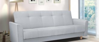
How to choose the color of a sofa to match the interior?
The sofa is the king of the living room, because it is on it that the most attention falls and it is the largest item in this room.
Choosing the color of a sofa is a responsible process, the tips listed below will help you figure it out.
- Monochrome option. This plan of action involves placing in a monotonous living room the same monotonous sofa, which matches the color of the walls and furniture, but is a slightly different shade.
- Neutral sofa. If the walls are painted in calm shades such as beige, gray or cream, then an excellent option would be to place a sofa in the same calm shade, only in a different one. For example, beige walls with a gray sofa.
- Neutral sofa in a colored interior. Surrounded by fairly bright walls, you can place a sofa in a very calm color, such as beige or gray. This way you can maintain balance and not oversaturate the room with flowers.
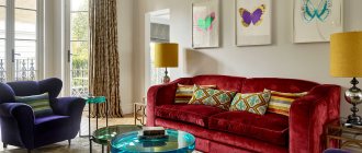
- Colored sofa in a neutral interior will create the only bright spot in the room, which is very popular in the Art Nouveau style. For example, a red, pink or green sofa will look great in a beige room.
- Bright sofa in a bright interior. This solution looks very juicy and unexpected. For example, a yellow or red sofa can stand against the background of blue walls, which will make the room incredibly colorful and positive.
Advice! The color of the sofa can be supported by other interior items: lamps, poufs, flower pots or vases.
Orange furniture
Sofa
A bright orange sofa will become the main focus of the living room, designating a relaxation area. Pillows of different shapes and materials will be a great addition. The sofa can be made of velvet, leather or thick fabric in accordance with the chosen style and decorated with studs, fringes or ruffles.
The photo shows a leather sofa in a modern style, complemented by copper rivets.
Chairs
The color of the chairs can be combined with the sofa or become a separate bright element of furniture. An interesting solution would be to remake an old antique chair. Depending on the stylistic direction of the room, chairs may have a wooden frame or a metal base.
Closet
Cabinet or chest of drawers doors can be glossy, mirrored or matte. Smooth and glossy surfaces and right angles correspond to modern and modern style. More interesting shapes will fit into classic, oriental and shabby chic styles. The wardrobe will be complemented by independent shelves, lamps and curtains.
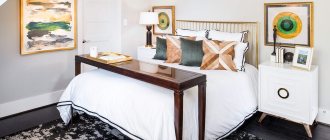
Bed
The interior of the bedroom can be absolutely neutral; a bright bed with a soft velvet or matte headboard will become a source of comfort for the entire room. If you want to maintain a more restrained character of the bedroom, bedding will help add summer colors.
Color in the interior according to Feng Shui
There is no specific canon of what the color of a huni or bedroom should be according to Feng Shui, since each color has its own energy and impact, therefore the choice of color depends on what you want to achieve. For example, the color for the bedroom can be chosen according to the criterion of insomnia; if you have such a problem, then dark red, burgundy, brown, and dark green are best suited. If everything is fine with your sleep, then choose lighter colors, beige, cream, peach.
It is better to avoid white color in large quantities, since among eastern peoples it symbolizes death.
Bright red or orange colors in the kitchen will encourage appetite, but if too much of these colors can cause aggression. It's better to use them as accents. It is also better to avoid dark, depressing colors. According to Feng Shui, kitchens should be light and spacious, build on this and make interesting accents.
It is better to balance the hallway, it should be neutral, so if your entrance is too light, feel free to use muted, dark shades, but you should not completely darken the room, it is better to choose a standard cream or beige as the main color. If the hallway is dark, on the contrary, try to use light colors, and just add light sources.
There are many feng shui tips for home improvement, you can divide the entire space into zones, career, family and fame zone, each zone should have certain color accents, career-blue, fame-red, family-green.
Correctly decorating a room according to Feng Shui is not difficult, but sometimes following all the rules leads to absurd decisions, so do not forget about common sense.
Which wallpaper to choose for uneven walls
Not all apartment owners can boast of smooth walls; wallpaper manufacturers have also provided many solutions for them. There are special wallpapers for uneven walls.
Of course, they can easily be glued to even walls, but their main task is to hide surface unevenness due to a certain texture and unclear pattern.
The main thing is not to choose wallpaper with regular geometric shapes, because on the contrary, they will emphasize all the unevenness on the wall.
Let’s also not forget that windows, and therefore the curtains that cover them, also play an important role in the design of a room.