In order to correctly select the color combination of walls, ceilings and floors, you must follow certain rules. Next, the secrets of the designers will be revealed and a table will be provided on the possibility of optically changing the internal volume using a play of colors.
To select the right color, you can use the color wheel
In order to correctly and beautifully combine shades in the interior, you should adhere to certain rules
- 1 Laws for choosing floor colors - a combination of house elements
- 2 Features of choosing flooring colors in the kitchen
- 3 Color combination of walls, floor and ceiling
- 4 Combination of floor and doors
- 5 How to visually change the volume using the floor?
- 6 Selection of carpet and wallpaper
- 7 Video: Combination of colors in the interior
- 8 50 photos of examples of the correct combination of colors in the interior: 8.1 See also
The combination of floor walls ceiling in the interior
Color combinations of walls, floors and ceilings can transform any room beyond recognition. By choosing the right shades, you can easily make the room visually lighter, more spacious and comfortable. Change the mood and atmosphere with decorations.
Create a formal living room, a strict, laconic office or a warm, gentle bedroom. We'll tell you how!
Monochrome and halftones
For several years now, interiors in the same range, but in different shades, have been in fashion. For example, combine a white ceiling with milky walls and beige laminate. Or bleached grayish parquet with gray walls and a tin-colored stretch ceiling - if you like non-trivial solutions.
This technique visually blurs the boundaries in the room and makes it visually larger.
Pale monochrome interiors are an excellent choice for rooms that are constantly lacking in light. But make the transition as smooth as possible and use only light adjacent shades. Avoid bulky furniture, too heavy textiles or bright massive parts.
If you have a large spacious room and you want to visually lower the ceiling, feel free to make it dark and the walls lighter. Cold gray shades on the floor and ceiling visually repel them, but warm brown shades attract them even more.
Light colors with a play of halftones are very popular in the fashionable Scandinavian style.
This is a rare example when walls that are darker than other surfaces do not narrow the room, but emphasize its geometry. Against this background, light wooden furniture and bright colored textiles look good.
Pastel colors
The absolute compatibility of everything with everything is the main advantage of pastel colors. This is a rare case where you can harmoniously combine 3-5 different colors at once. Due to the fact that they are muted, the decoration does not seem flashy and overloaded.
Pastel interiors are the atmosphere of French Provence and the eternal celebration of spring. They make the room visually lighter, lighter, airier, without pompous seriousness. This is a good choice for a bedroom, kitchen or girl's children's room.
Choose bleached wood laminate flooring or warm sand and walnut shades. It is advisable to make the ceiling a little lighter than the other surfaces - this will make the room seem larger and more spacious.
On the walls you can combine several colors at once: pink with lilac, blue with beige or lavender with turquoise. Use paint or companion wallpaper, alternate stripes, divide the surface in half or create accent walls.
But then it is better to take neutral and monochromatic furniture, without unnecessary decor.
In the kitchen, the floor, laid with a mosaic of multi-colored small tiles, looks interesting. It can be mirrored onto an apron above the work surface. Make the remaining walls one neutral beige or milky shade.
In fairy-tale children's rooms, multi-level ceilings that combine several colors look interesting. Combine fancy shapes from glossy canvases or make a blue ceiling “under the sky.”
Gradients
A smooth transition from shade to shade, which is also used in monochrome interiors, is called a gradient. But if monochrome interiors in general resemble monochromatic interiors, then gradients can be rich and bright.
For example, from white tiles to a red glossy ceiling through salmon walls. Or from a creamy ceiling through café au lait wallpaper to dark walnut laminate.
If you manage to find an intermediate tone, you can even combine two bright colors. On the walls there are very good transitions from pink to turquoise, from orange to blue and from green to purple. Modern interiors will be freshly complemented by a gradient from warm beige to graphite gray.
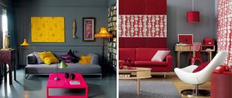
Contrasts
If you need to visually change the geometry of a room, your first assistant in this is contrasts. The principle is used in both classic and modern interiors.
Most often it is white and black, but any light or dark shades will do.
If the room has a low ceiling, paint it light and make the floor dark. Choose wallpaper with an elongated pattern, vertical stripes, or make one wall an accent wall. Avoid any wide horizontal lines in the decoration and interior that “cut” the height.
To visually balance a narrow room, make long walls light, and short walls dark and contrasting. This technique seems to compress the room in the right direction.
Make the floor and ceiling neutral, the furniture light, and bright accessories add color.
One of the classic combinations is a dark wooden floor with a white ceiling, walls and bright furniture. Light finishes with colorful details look good in modern interiors. And black and white classics are universal everywhere: from minimalism to artsy modernism.
Natural colors
Nowadays, naturalness in all its manifestations is in fashion: in materials, shapes and colors. Eco-style interiors combine all shades of wood and green. Other natural colors are used less frequently: yellow, red, blue, sea wave.
Complete the range with black if you need contrasts, or white if you need to add light.
A dark wooden floor with beige walls and a white ceiling looks good. They are combined with gray furniture and bright green textiles. And a corner with your favorite geranium or succulent seedlings in colorful clay pots will add freshness and life.
Wooden wall panels to match the laminate will help create the atmosphere of a country cottage.
Mediterranean style with rattan, woven floor rugs and turquoise walls also fits into the natural palette.
Cool and warm colors
Traditionally, we perceive warm colors as lighter and cozier, and cool colors as fresh and austere. In northern rooms, warm colors will greatly help maintain the mood. But in the south, cold finishing of walls and ceilings will save you during the summer heat.
It is recommended to use cool shades in an office or workshop - they improve concentration and help focus. But warm ones are needed to relax in the bedroom or feel that same feeling of home in the living room.
Previously, it was believed that the interior must be designed in tones of the same type. But now cold and warm contrasts fit well into eclectic fashion. For example, a restrained combination of gray and beige or an extravagant combination of red and blue. The main thing is that both shades are approximately the same brightness and saturation.
What floor color is better to choose?
- Among the common solutions is the choice of natural, that is, natural colors for covering floors in the kitchen. These are all the colors of wood, brown, light yellow, beige, as well as other shades that will be relevant at all times. These colors go well with most traditional colors used in the interior. They allow you to create classic and calm interiors that are not devoid of style.
- Floors with shades of red in the interior can also be called a classic option, but they are used today a little less frequently than before.
- A mahogany or cherry-colored floor in an apartment interior can bring an atmosphere of wealth and luxury, but to a certain extent it will dominate the space, especially when a very dark shade of the walls in the kitchen is chosen.
- A black floor in an apartment is one of the favorites of modern interiors; the combination of such a floor and walls in white shades or just a very light color looks especially chic. Floors of this color in the interior of an apartment are ideal for all modern styles, especially minimalism.
- White floors in the kitchen are not a bad option, because they give a certain airiness, and the combination of elegant furniture and colorful accessories will help create a truly impressive and stylish interior.
- Gray floors are an excellent option in a modern kitchen. This floor will look great if you choose the right light walls.
Black floor in the bathroom
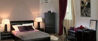
Brown striped floor in the living room
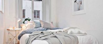
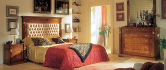
Light wooden parquet in the bedroom
Black and white room
The combination of floors and doors in the interior
Until recently, designers sought to choose a single color scheme when decorating the interior. Now fashion trends are different, and the shades of doors, floor coverings, and baseboards may be different. The main thing is that the combination of primary colors is successful and corresponds to the main law of the interior: the trinity of tones.
Simply put, when selecting finishing elements, you should allow the presence of no more than three primary colors in one room.
Professionals have developed recommendations for choosing colors for doors and floors depending on the type of room:
- Kitchen. Due to the small size of the room, it is important to carefully select the color of the floor; it should not reduce the space or cause irritation. Light colors are more suitable: beige, white, yellowish, ashy, although for the washing area you can choose dark brown, chocolate tones of tiles or other finishing materials. It is also better to make walls and doors light, especially in low light conditions.
- Bathroom. Previously, designers believed that up to 50% of the bathroom space should be white. But now the opinion has changed: such a room looks boring, although it increases the brightness of the lighting. A good solution for walls is light gray, blue, light green, lavender colors. The floor is decorated in the same colors, but a little darker, the doors are also made light, dim. Brown doors are suitable for sand floors, which fits perfectly into the classic style.
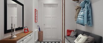
- Hallway. This small room is the first to greet guests and creates the impression of home. Most designers prefer dark colors when installing floors, because they are more practical. In small hallways it is better to make the floor light or interspersed with dark areas in the center. The floor can be bright; it goes well with light walls and doors.
- Bedroom and living room. Here it is better not to allow extremes, too dark and light shades. The ideal option is cool or warm medium brown tones for the floor and slightly lighter for the doors.
Laws of color selection
The color range of floors and doors is a little more limited than when decorating walls with wallpaper or painting. However, when you come to the store, you will see a fairly wide range of shades of laminate, parquet boards, linoleum, baseboards or tiles. The first thing you need to determine is what kind of floor you need - dark or light. Both options are good and appropriate if used for the right room and design.
What effect does the floor shade create?
- a light shade is an excellent light reflector and space enhancer. Additionally, it gives the space a clean and fresh feel when paired with a light shade on the walls. This is a universal solution for the living room and bedroom. However, if you combine light floors with cool wallpaper, you may end up with an uncomfortable atmosphere. This is especially true for the northwestern location of the rooms;
- a dark shade is stability, style and bright contrast, provided it is diluted with light wallpaper for walls, furniture and decorative elements. The combination of a dark floor and the same doors can add gloom. Whereas the use of contrasting accessories to match the floor against a general light background looks very harmonious. But this solution is only suitable for rooms that receive enough sunlight.
There are convenient special online applications that help you choose the right color combination of the floor to the wallpaper and other finishing elements in the apartment.
One of the fashionable techniques is a play of contrasts, when a white floor is combined with almost black furniture and vice versa. The same goes for the color of doors that contrast with the floor. Such techniques will negate the possible excess of white and the heaviness of black.
The combination of floor and walls in the interior
- Dark floors and light walls will make the room appear wider. With this combination, a dark ceiling will reduce the height of the room.
- A dark floor and dark walls will create a closet atmosphere; it is not recommended for rooms smaller than 20 m2.
- Light floors and dark walls will highlight the contrast of the furniture and diversify the room, especially in combination with white wall decor.
- A light floor and a wall opposite the window will make the room deeper.
- A light floor and light walls will expand the room, but in combination with white furniture they will create a feeling of excessive sterility. To avoid this effect, add shades of warm wood to the interior in furniture - alder, walnut, beech, oak.
How to diversify the walls and ceiling of the same color
The technique for creating a monochrome design of walls and ceilings is known for its ability to visually increase the height of the ceiling. Plain walls and ceiling will look good in combination with a darker shade of the floor, which harmonizes the lightness of the room with a monochrome design.
If the walls and ceiling are painted the same color, then you can diversify them using plasterboard niches equipped with neon lighting
How you can diversify a monochrome solution for walls and ceilings:
- Bright color. If the question of visually raising the ceiling is not too pressing, then you can make the walls and ceiling a pleasant and fairly bright shade. This solution is suitable for the living room or kitchen. Choose the color wisely so that the eclecticism of such a room does not become a living hell for you.
- Skirting board. If you have a light ceiling and walls, then a plinth 2-3 shades darker than the chosen color will pleasantly transform the room, decorating the awkward corner between the walls and the ceiling.
- Contrasting wall. An excellent solution, often used in the bedroom for the wall to which the head of the bed adjoins. The idea is implemented by decorating one of the walls using photo wallpaper, regular wallpaper with a bright pattern, painting, and so on.
The same design of walls and ceiling is not as boring as it might seem at first glance.
How to choose the color of doors in the interior?
The combination of the color of doors and floors is very important for the harmonious perception of space, since the theater begins with a hanger.
Doors fit harmoniously into the interior when their shade matches the color scheme of the floor or contrasts with it.
- One color palette of doors and floors should be chosen for hallways when several doors open into one room, this way you can avoid confusion.
- The emphasis on the doors can be made using contrasting shades of the doors and floors, but in this case, the doors should be combined with the color of the furniture in the room.
- The plinth should be the same color as the trim to unify the composition.
The combination of the color of the floor and the doors in the interior gives us an idea of the room. You can choose a single palette or a contrasting combination, but try to adhere to the main rule - no more than five different colors in the interior.
How to visually change volume using flooring?
The selection of floor colors based on other surfaces significantly affects the overall appearance of the room. Having considered the combination of colors in the interior, you can create a table on how and what color to choose for the floor, ceiling, walls and furniture in order to significantly change the area.
| Floor shade | Wall shade | Ceiling shade | Furniture shade | Change of space |
| dark | light | light | light | Increases volume |
| dark | light | dark | neutral | increases the area, reduces the height of the room |
| light | dark | light | Dark or neutral | raises the height of the room, narrows the space |
| Dark | Dark | light | light | feeling of a basement or well |
| dark | One dark wall | light | light | the walls move apart relative to the dark wall |
| light | One dark wall | light | dark | reduces the length of the room, increases space |
| light | dark | dark | neutral | compresses the area, creating a feeling of a cave |
By choosing rich tones of all surfaces, you can get a closed cube, which is absolutely not comfortable to stay in for a long time. Such options are usually used when decorating large halls using birch furniture and good lighting, as well as when decorating nightclubs and bars.
The selection of floor colors based on other surfaces significantly affects the overall appearance of the room.
Having considered the combination of colors in the interior, you can create a table on how and what color to choose the floor
A light floor raises the height of the room and narrows the space
Depending on the desired result, the color texture of the floor is selected:
- tones of red - perfectly emphasize the contrast and prevail over other surfaces, clearly indicating the horizon;
- blue colors - expand the layout, preferable for the sunny side;
- shades of yellow – solar warmth and light;
- tones of green - create comfort and peace, well suited for creating a relaxation area.
Based on the above, we can conclude that in order to bring any plane closer, it must be made darker. To increase volume - light.
The floor can be made in one color scheme
To bring any plane closer, it must be made darker
See alsoColor combinations in interior design
The combination of a gray floor in the interior
Gray color is dearly loved by designers for its ability to be combined with most shades. It will add softness and texture to pastel palettes, dilute dark ones and soften complex colors, making them more natural.
A soft ash shade is irreplaceable in rooms with contrasting color schemes.
It removes aggression, makes a smooth transition in the contrasts of black and white, white and red, black and red.
Interiors that combine different variations of gray are stylish and elegant. In this case, it is better to make the floor in the lightest shade available or in the darkest. Bright details can add bright accents to a monochrome room. The latter can be yellow, orange, crimson, turquoise.
It is better if there are textiles, accessories, and finishing elements in a bright design. An excellent option is to paint one of the walls (or part of it) in the specified colors.
The gray floor forms a harmonious tandem with lavender, pale pink shades, as well as wine, pastel blue and green colors.
If we are talking about a room in a classic style, then it is recommended to use dark gold as a decoration.
It is recommended to combine a gray floor with doorways of the same shade. Another win-win option is a combination of a light gray floor with doorways and wenge or oak colored panels.
Thanks to the ash tone of the floor, wenge looks even softer and more elegant, and the oak shade looks even deeper and more majestic. By the way, wenge looks good with both warm and cold gray.
If the floor is a very light gray-beige, then milky, light brown and pastel doorways and doors will also work.
Gray color is capricious in combination with cold shades. The only exceptions are the blue and light blue palette.
Playing with fire: red ceiling and walls
Experimenting with color is very cool. Especially if you are not afraid of change and you like everything new. Red is perhaps the most active color with which you need to be careful if you are renovating and choosing your favorite shades for the room.
A red ceiling and white walls are well suited for an interior designed in high-tech or modern style
The influence of red color on humans:
- Stimulates energy and increases blood pressure.
- Causes an active emotional background.
- Sets a person up for development and social growth.
If you have a very unstable psyche, high blood pressure or excess weight, then the color red in such quantities can have a bad effect on you.
Brown floor combination in the interior
When choosing dark brown flooring, you need to take into account the color scheme of the various elements of the room.
Chocolate coating goes well with light, gray doors.
The ideal option is dark brown floors and doors, beige walls with a white ceiling. The hanging canvas in such an interior is decorated with a gilded pattern. The classic combination is a dark, rich brown floor and snow-white doors.
Whatever material is used to decorate the walls, it is important to create a harmonious combination with the floor covering.
Modern interior design ideas allow you to create original design options. For bright walls covered with large-patterned wallpaper, choose a coating several shades darker. Light, pastel surfaces with floral prints and geometric patterns harmonize perfectly with dark brown materials on the floor.
The color of the baseboard for a dark, chocolate coating is determined by the capabilities of the room. They can be the same color and blend into each other. This is necessary when placing emphasis on other interior details. Often dark floors are edged with a white baseboard, which allows you to create a clear line of demarcation between surfaces.
For a brown canvas, choose a plinth of the same color or charcoal black (sometimes with gray veins).
Furniture on coverings the color of dark chocolate or a rich coffee shade looks more impressive if it has a different texture. Glossy floors do not tolerate a similar environment. Light wood balances the color scheme. The dark outline of the furnishings is combined with light upholstery, ornaments, and decorative elements.
Plain white furniture looks great on a dark brown floor.
A dark brown floor should not be combined with bright, flashy colors. He prefers calm pastel colors: beige, coffee with milk, caramel. Such a union provides warmth and comfort, creates conditions for relaxation and psychological relief.
Selection of carpet and wallpaper
At one time, carpets went out of fashion and were rarely used in design projects. Today they are again an integral part of bedrooms, children's rooms and living rooms. The variety of patterns and pile heights allows you to use carpets and rugs in any room.
In order to achieve a good result, you need to decide not only on the shape, but also on the shade of the carpet.
- A dim room in pale colors will be decorated with a bright product. In addition to it, you can use decorative pillows made in the same color scheme.
- The classic style can be supported by a carpet with a calm pattern. The main thing is to choose a suitable shade so that it does not get lost and at the same time is combined with other elements of the decor.
- For small rooms, as a rule, large-sized carpet is chosen in calm and soft colors, preferably monochromatic. They will optically increase the size of any room.
- In large halls and bedrooms, small rugs with a three-dimensional pattern are laid to highlight any area. A voluminous flower or animal face looks great in a large space and presents itself favorably. Rich and warm colors are used in spacious living rooms to highlight a specific area.
The design of the room is made in one color scheme
The room design is made in light colors
A certain role in decorating an apartment is assigned to the purchase of wallpaper.
A certain role in decorating an apartment is assigned to the purchase of wallpaper. The colors and patterns applied to the walls are of great importance in visual perception:
- horizontal stripes on the wallpaper reduce the height, make the room wide and low; if you make only one wall in a long corridor striped, it will be visually closer;
- vertical stripes lift low ceilings, the effect increases with the width of the strip;
- a large pattern brings the walls closer, so in small apartments it is not recommended to use wallpaper with such a pattern or to cover only one wall with it in an elongated room;
- a small pattern expands the walls - cream wallpaper with a small pattern applied to it optically enlarges the space;
- wallpaper with wide transverse stripes pasted onto the ceiling brings the opposite wall closer and pushes the side ones apart; this method is widely used when creating the interior of narrow halls and corridors.
Cool colors can visually increase the area of a room
Light shades are preferable to use in large rooms
Based on the above, the following conclusions can be drawn.
- Bright, rich warm and dark cool tones reduce the space, but at the same time make it original. They are unacceptable for small apartments.
- Pale pastel and light cool shades increase volume, expand walls and raise ceilings. They can be used in the design of any room.
See alsoBasic principles of design of a 3-room apartment
The combination of white floors in the interior
All shades, from light to dark, go well with white. The selection of companion colors will influence the subsequent perception of the interior.
The classic combination is white with black and red. The contrast of shades allows you to highlight details and correctly place accents. An example would be the design of the floor in white, the walls in black, and the presence of red accents. Or, alternatively, a combination of black and white tiles.
White plus sunny orange and yellow lift your spirits and charge you with energy when choosing bright shades. Pale yellow and washed out orange and white look much calmer and more elegant.
The emphasis on purple is often made by creative individuals who have many interests and are constantly developing. The perception of design in blue and green, with the presence of a white floor, also depends on the selected shades.
It can be contrasting and catchy with bright blue and sleepy green, or create the impression of a romantic and soft atmosphere when choosing soft blue and light light green tones.
A multifaceted classic combination can be white, which is mixed with a brown range of colors. At the same time, the result is warm, creamy chocolate combinations that do not irritate the eyes and can serve as the basis even for a classic interior.
Features of the color of flooring in the kitchen
In the kitchen and in the hallway, unlike other rooms, you can use tiles or linoleum, which gives considerable scope for imagination. And there are no limits here, because in the kitchen you can put bright red, yellow, green tiles, and to avoid excessiveness, alternate them with white. By correctly combining this floor design with the tiles on the walls and the color of the facades, you will achieve a cheerful and cheerful atmosphere. In such a kitchen you will want to create exquisite and original dishes.
Related article: How to choose plaster for leveling walls and ceilings
However, strict flooring colors are also popular in the kitchen. This is a classic style, Provence (How to decorate a kitchen in Provence style: tips and tricks), which has beauty realized in natural colors. The current trends in kitchen flooring are laminate flooring that imitates powerful oak floors in ash, chocolate and almost black colors.
When choosing Provence, keep in mind that the entire kitchen interior must match. Everything in a rustic style should be in harmony: textiles match the wallpaper, the shade of the furniture matches the floor.
Light brown floor combination in the interior
Brown color in the interior takes on special meaning. It symbolizes naturalness, naturalness and tranquility. Used in different styles. Goes well with all kinds of shades. Suitable for rooms of any purpose: kitchen, living room, office, hallway, bathroom.
It is rarely used for a bedroom or recreation room and only in lightened colors.
The brown shade is not recognized as the main one. It is obtained by mixing red and green tones. Therefore, when decorating any direction of the interior, it harmonizes so well with many tones of the palette.
It helps to unite all the colors that will be present in the room.
Brown and beige
This coloring remains characteristic of classic and Victorian interiors. In limited quantities, harmony of tones may be present in the loft and baroque directions. Beige and brown are similar tones. The interior immediately acquires pleasant and soft features.
This environment can be easily diluted with bright accents in the form of decoration and some pieces of furniture: chairs, poufs, armchairs, coffee tables.
In such a tandem, the role of the background is given to the lightened tone of beige. He must remain dominant. Brown will help focus attention on significant objects: dining area, tabletop, floor or wall accessories.
In rooms where beige predominates, a ceiling lamp or miniature wall sconces are decorated in brown. Such lighting sources are suitable for any room: kitchen, living room, hallway, corridor.
If the room has a large area, then complement the beige tone with a brown countertop, window sills or window frame.
Brown and white
The combination of brown and white remains relevant for any stylistic decision. This tandem turns out brown, symbolizing grooming and a sense of taste. Such harmony fits well into design styles such as modern, high-tech, Provence, and eco style.
For the listed areas, the use of several shades of brown is encouraged.
The outline of any room with a predominant brown color will be created by narrow baseboards, baguettes and door frames. Perfectly painted snow-white slopes on windows and interior doors will help improve the interior.
Don't go too overboard with white. A good option is equality of tones. A good combination of brown and white in upholstered furniture, living room armchairs, ottomans. Shades can be smoothly blending into each other or used proportionally.
In the bedroom, they try to use brown with restraint. After all, such a room should be in neutral colors that promote relaxation. The white walls of the room and the bright light from the window will be well diluted with dark brown curtains. The addition of a companion shade is welcome.
Turquoise or blue attracts attention. Its role is given to a chair or mini-sofa located according to Feng Shui for relaxation.
A strict minimalist or modern design looks good in a bedroom with a predominance of white and brown colors. Such harmony is used as equals. The dark wall at the head of the wooden bed looks good against the backdrop of natural light coming from the window. The effect of airiness, lightness and serenity is given by snow-white tulle from ceiling to floor.
Soft armchairs, bedside seats and bedside tables are chosen in the same style. They draw attention to themselves.
Brown and black
The combination of black and brown shades is appropriate for spacious living rooms, hallways, and corridors. Such harmony is appropriate for studio apartments or combined rooms. The use of shades in a retro style is typical.
A successful technique for such a tandem is brown laminate on the floor and black walls. The latter are coated with paint or decorative plaster. Several options for shades of the main tone are used: from dark brown to light: sand, mustard. The decor in the room is always done in richer dark colors.
The predominant materials are: parquet, tiles, laminate, wood. To optimize space and its functionality, strictly wooden furniture is used.
Rich brown is best left for upholstered furniture. In a black palette, choose ottomans, household appliances, and decorative elements: shelves, paintings, wall clocks. A matte charcoal shade in accessories will look good against the background of light brown, almost coffee-colored walls.
This situation will be diluted by a wall set with closed shelves. If it is open, then a plasma TV will take its place in the center.
Living rooms that have free space are decorated in dark tones of black and brown. The first can be seen in upholstered furniture finished with eco-leather; brown is used for walls with wooden paneling and parquet boards on the floor.
A TV and a floor shelf with a glossy glass facade will add richness to the room.
Brown and pink
The first place where brown color can be used in the interior in combination with pink is a children's girl's room. The main role is given to the light pink tone, which is used to decorate the wall at the head of the bed.
The bedspread is decorated to match the color of the walls. But the curtains and the area under the ceiling molding have a dark brown tone with white decoration. The role of adding a light brown tone is given to lamps with textile shades. They stand on white bedside tables.
In spacious adult bedrooms, brown acts only as an accent. It can be seen in upholstered headboards and throws. Oversized bedside tables with unusual fittings are made of dark natural wood. They are varnished, which gives the set a rich brown tint.
A combination of brown and purple shades looks good in any interior. But this option is very good for antique interiors: retro, rustic. Shades of pink are present in furniture, curtains, and decorative elements. The role of a dark brown shade is given to the ceiling beams, central lighting, and coffee table. If the house has a fireplace, then its doors are also painted brown.
Here one cannot do without a companion color for wall cladding. White, beige, peach or cream are suitable for this purpose.
Brown and blue
Blue is a noble shade. It is used for bedrooms, small rooms, halls and living rooms. Often present in the kitchen. This shade suits creative people, evokes positive emotions, encourages creativity.
Brown in tandem with blue can visualize space well. Therefore, it is used for small rooms.
A striking example is a soft brown sofa for the living room with blue throw pillows with a floral theme. The room should have plenty of blue and several tones of brown: from light to dark.
Lightened is used in laminate or parquet boards, looks good in wooden furniture: chests of drawers, bedside tables, as a frame for a glass coffee table.
A brown set made of natural wood harmonizes well with a soft sofa with blue square pillows. An elegant ornament and monograms are created as an accent. The decoration will turn out to be restrained if, in addition to the blue color, you add bright orange textiles or pillow cases to it.
A similar combination of brown with a predominant blue or turquoise is suitable for interiors in an old style. Brown pieces of furniture in a retro style and antique facade design fit perfectly into a room with high ceilings. The fireplace, located in the center and framed by stucco molding painted in a dark blue tone, will add an unusual effect to the living room.
Against the background of a blue wall, the following decor looks good: long vertical mirrors, photographs or paintings in frames, an abundance of lamps with round shades.
Brown and purple
Frame furniture made of wood with soft backs and seats is made of purple velor or other soft textiles. The wall is finished in brown and is made in the form of brickwork. Dark purple rugs are laid on the dark tiled floor. Transparent or perforated furniture is placed on top of them.
The decor includes metal ball ceiling lamps and a black floor lamp with ruffles.
Bedrooms in a modern style are well distinguished from others by the arrangement of furniture and the decoration used. The tandem of brown and purple fits well into the interior of the rest room. The headboard of the bed becomes a bright accent. The dark shade is repeated in the decorative pillows and pouf.
Otherwise, light brown walls go well with slightly darkened flooring.
A palette in which both brown and purple tones occupy the same proportions looks harmonious in the room. The latter belongs to upholstered corner furniture. The wall behind the sofa is finished in a light brown shade. A thin varnished board is used for this purpose.
The dark color of the armchair frame and coffee table in the center of the room adds variety.
Brown and green
A bedroom with muted shades of pistachio and brown will be original. In such an unusual design, an elegant high bed with lush pastel accessories in a green shade looks good. Brown predominates in armchairs, throws and bedside furniture.
Decorating in the form of a chessboard on the wall and bedside seat adds chic, uniqueness and richness.
A bedroom with a spacious bed and throws in brown and green still looks relevant. More suitable for modern and contemporary interior styles. In this combination, an equal ratio of tones is welcomed. This way the room will not be overloaded.
Dark floor
It should be noted right away that a dark floor is considered not only brown or black, but also dark shades of other colors.
The dark color of the flooring brings a feeling of warmth and comfort to the interior, but at the same time visually it noticeably conceals the space. Therefore, it is more logical to use dark floors in large rooms, adding glass and metal objects to them. When choosing, you need to remember that balance must be maintained: dark floor – light walls, otherwise the room will instantly turn into a gloomy dungeon.
Features of use
- Dark surfaces (except black) get dirty less and are more practical. But they also need regular care.
- The combination of “dark floor – light furniture” is considered common, but a number of designers recommend choosing objects that are only a few tones lighter than it for a dark floor.
- If such an interior seems gloomy to someone, creating a painful atmosphere, then these people can use the well-known design maneuver: combining a dark floor and light walls in the interior. Furniture in this case can be of any color, because such an interior is characterized by “omnivorousness”.
Advantages
- Many dark shades have a positive effect on a person’s well-being, they are calming and do not cause irritation. It has been noted that a light kitchen with a dark floor even helps to digest food better.
- The dark floor adds seriousness and solidity to the interior.
- It averages out the proportions of oversized accessories.
Flaws
- It is better not to make a dark floor in a room where there is not enough natural light, but, on the other hand, if the sun's rays directly hit the floor, they will highlight the slightest defects in the coating, and even a small amount of dust on its surface will immediately become noticeable.
- On a dark glossy finish, all the stains from washing the floor will be clearly visible. Therefore, after washing such a floor will have to be additionally polished.
- Dark varnish is very easy to scratch, and all the smallest scratches will immediately become visible.
Photo of a dark floor in the interior:
Choosing a dark floor shade
The final effect greatly depends on the correct selection of color tone, which can be understood by comparing a dark floor and light doors.
- Shades of chocolate will make the interior expensive and cozy due to their warmth.
- Thanks to the black color, the home will acquire a modern individuality and even extravagance.
- Somewhat aloof dark gray tones will make the atmosphere cooler.