Features of brown color
The brown shade has a whole list of advantages, including:
- practicality - dirt is not too noticeable on such a surface, so the kitchen does not need weekly general cleaning;
- versatility - a kitchen in brown tones looks great in various directions, especially in classic, African and rustic, Victorian and English styles, country and loft, eco- and ethnic styles;
- the ability to create a peaceful, positive state;
- naturalism - brown color is associated with natural materials, which predominate in such an interior and evoke in people a subconscious feeling of security
Shade options
Brown is a warm color, no matter to what extent its commitment is manifested. It has the property of making objects heavier and moving away without changing their size and volume.
Therefore, a brown kitchen will most clearly demonstrate its capabilities, provided that it is arranged in a spacious room with large windows facing east or northwest.
But this does not mean that the kitchen cannot be organized within the perimeter of a small kitchenette. Simply, in this case, you will need to rely on other details and moments.
In addition, do not forget that kitchen brown color is ideal for people with a conservative and calm character, intellectually developed people, and representatives of the business sphere. Surely, there are such members in your family, please them with your attention and care!
Combinations of brown with other colors
A beige and brown kitchen is an ideal combination, since in such a space both shades reveal themselves to the maximum and ennoble each other.
Dark brown curtains and furniture with laminated or wooden facades such as “walnut”, “cherry”, “hot chocolate” look good against the background of beige walls.
In a spacious kitchen, you can play with the opposite option - a dark wallpaper background, setting off light, elegant furniture made of ash or with milky-creamy lamination.
This move may be unconventional, but it will completely “pay for itself” with its originality, sophistication and ready-to-wear style.
But a yellowish brownish tint, like linden, requires a slightly different approach. It won't do well on a beige background and won't perform well if the walls are dark brown.
This brown goes better with olive, sand and milk, which emphasize the yellowness and golden “sparkle” of this range.
A color scheme
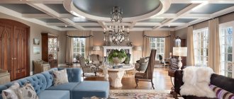
The noble brown color is used in the design of any style and direction, both classic and modern. The practicality of such decor is obvious on brown surfaces, especially dark ones; dirt is almost invisible. A wide variety of brown colors in light and dark shades provides a wide range of choices.
One of the key properties and advantages of brown is combinatoriality. This color goes with almost any color. With its help, you can mute bright tones and make obviously boring shades more interesting.
Brown color is used in any design style
When combined with other colors and shades, the brown palette does not separate, but organically combines the differences into a coherent composition. Let's look at some examples.
With beige
Brown and beige are a good solution. They are balanced in relation to each other, because they belong to the same palette. The interior, designed in brown and beige, creates a special atmosphere of homely warmth. This is an excellent option for the design of a bedroom, living room, dining room. The inclusion of bright elements in the form of curtains and various accessories will highlight the interior.
For the nursery, you should choose a more cheerful decor. Here brown is best used in combination with pink. In the bedroom, such a solution may also be appropriate, as it creates a comfortable atmosphere of gentle romance.
The practicality of such decor is obvious
Dark brown
Associated with shades of coffee and dark chocolate. These are the colors of the classic range, giving the interior nobility and emphasizing high status.
Combinations with other colors and shades can be used to decorate the interior of a room for any purpose in the house. This could be a living room, bedroom, hallway, kitchen or other room. Brown, along with green, is a means of providing a calming atmosphere. The design is preferred by people who intuitively strive for peace, because they are susceptible to unrest and feel more comfortable in such an environment. Conservative shades are more than appropriate in a classic-style interior.
Brown and beige are a good solution
It should be remembered that the shade of chocolate is too dark to be used alone. A small room decorated in chocolate tones will seem gloomy and cramped, like a rabbit hole. To avoid such design mistakes, it is wise to use additional colors to break it up.
Combination with other colors
One of the most suitable colors for a pair with dark brown is white. Although the combination of brown and white looks rather bland, and therefore additional expressive accents naturally ask for it. Bright colors provide a wide field for design experiments. Neutral white will always help to cope with overly darkened corners.
Dark brown and beige are a very successful duet. Beauty and balance are equally present in this monochrome combination, since both of them are part of the same color scheme, but at the same time are as far apart as possible from each other.
This color goes with almost any color
Beige and brown shades create a warm atmosphere in any room. Especially compared to the brown and white duo. The combination of dark brown and beige seems to be a good solution for decorating a cozy interior of a living room or bedroom . The ideal completion of the picture is bright accents . For example, textiles and other items.
With red
Red-brown is associated with mahogany and looks luxurious in the interior. Serves as the personification of quality of life and respectability.
Brown color forms a spectacular pair with red in the interior. This is a traditional solution for the English style; it is often used when arranging offices and living rooms.
The shade of chocolate is too dark to be used solo
Red and brown are related colors, and therefore in a duet they look very harmonious in the interior. This decorative effect is achieved by incorporating red into complex dark brown shades.
Discreet and practical are associated with stability and hard work, and the presence of red in the interior gives the atmosphere nobility and makes it respectable.
The use of such a tandem seems especially successful in combination with wooden objects in the interior.
The room creates a warm, cozy and especially homely atmosphere.
The combination of brown and red in the design, for example, of a living room, is organically complemented by white. A catchy, bright and even appetizing interior design is guaranteed.
Discreet and practical interior
With green
This is a harmonious couple. One naturally complements the other, just as in nature the trunk and branches of a tree continue the leaves. Nothing compares to natural fantasy; these are the best combinations in terms of aesthetics.
In pair with green with a predominance of yellow tone, you should choose chocolate to achieve maximum visual effect. Thanks to lemon shades, the brown interior becomes lighter and the mood in such an environment lifts itself. This design looks most advantageous in the kitchen, dining room and living room.
The spring combination of young foliage with tree bark is pleasant to the eye, uplifts the mood, fills the soul with optimism and harmony. In the interior, this fresh and natural combination looks as organic as in nature.
Classic style
In the living room, the walls of which are decorated in brown tones, elements made in light green, pistachio, and lime shades look interesting. Such an environment helps you relax and have a good rest; after working hard during the day, your nerves and thoughts will be in order.
The combination has certain advantages:
- It doesn’t matter which component of the color pair is dominant, harmony will remain in any case.
- Green apple in combination with a chocolate shade does not require dilution with other colors.
- In the interior, brown furniture is organically complemented by textiles and accessories in a green palette.
In the interior of the bathroom
Brown in a duet with green seems to be the most stable color solution and the calmest combination of two natural shades given to us by nature itself.
Unexpected combinations
An excessively dark brown kitchen in the interior will look less strict and official if you combine the dark palette with somewhat unexpected colors, for example, turquoise and blue, pinkish, peach.
Such shades will soften and refresh the interior, visible in textile accessories, in the patterns applied to enamel dishes and kitchen devices, in the coloring of ceramic sets for cereals and sugar.
The light brown color scheme goes perfectly with bright and sunny yellow, red, and orange. They support, but do not compete with each other, but if the main brown color is darker, this palette will be unnecessarily “pressure” and cause psychological discomfort, and together with the gray-black style, it will make the kitchen several times smaller.
What color goes with brown in the kitchen?
The ideal partner for the brown spectrum is caramel, beige or sand. This combination in one room looks expressive.
Brown is a natural shade, which means that its native colors will look great paired with it:
- spring green;
- summer orange;
- berry red;
- sunny yellow;
- sky blue.
It is important to remember the following nuances:
- If the windows face the sunny side, then cooler colors should be selected for brown - blue, gray or sea green.
- The lack of sunlight is compensated by combination with orange, light brown, bright yellow or delicate beige.
In general, the brown palette is universal, so any other color other than black and white is suitable for it.
For those who doubt the luxury and coziness that can be felt while in a brown kitchen, the answer is clear: the process and result of the design is exciting.
Materials
In the concept of a natural brown kitchen, you can use coarse natural linen - napkins and tablecloths, Roman blinds can be made from it. Linen will perfectly complement the “picture” in a rustic or country style, and will also perfectly emphasize the wooden texture.
If we talk about metal, then only from the point of view of forged products. High-tech chromed metal does not combine with natural materials and brown tones, but bronze, aged iron, patinated metal are what you need.
Let’s not forget about stone, from which two benches for the dining table, the table itself, the tabletop and the window sill can be made. In Japanese cuisine, stones can be used in decoration, for example, in the stylization of a bansai or a stone garden.
Photo examples
A very elegant neoclassical kitchen with white solid and glass fronts and a black worktop with a slight gloss. In the photo, you should pay attention to the lighting - it was made according to zoning rules in order to emphasize the large area.
Another standard black and white option. The kitchen itself is white, and the ceramic splashback and wooden countertop (MDF) are made in black. Interestingly, the ceramics are matte and the countertop is glossy - quite a bold combination! Similar facades are often used in Ikea interiors, where you can find many interesting ideas.
Here is an example of a non-standard, but very beautiful combination of colors. Pay attention to the wallpaper matched to the white kitchen and dark countertop with a black hob. This design is thought out to the smallest detail:
- the color of the walls matches perfectly with the countertop;
- the apron also goes well with the tabletop, due to the pattern, and with the set, due to the background;
- both the apron and the tabletop are made in gloss;
- even the chandelier is chosen with a pattern reminiscent of an apron.
A tremendous amount of work has been done here.
In this photo example, it is important to pay attention to the color of the sink - it is gray, not white, despite the fact that the countertop is black. This was done specifically to seal the mosaic seams with the same gray color so that they do not lose their presentable appearance so quickly.
It's worth noting that this still pairs with a white set. Pay attention to the pattern of the tabletop - white speckled. This is one of the most practical options for dark surfaces.
It is worth noting that on a black or dark white countertop there can be not only a sink, but also a stove or hob. Such elements are not prohibited, but are only encouraged, as they make the interior more interesting and dynamic.
White and silver household appliances always look impressive on a black or dark countertop. Pay attention to the previous photo - these two colors are exactly what is presented: white hood, coffee maker, toaster, hob, silver mixer and fruit plate. A great start to a modern style in the kitchen.
White classic kitchen with black stone countertop (artificial material). It is advisable to update the apron and choose a more sophisticated option.
Another option for a light kitchen with a black countertop: white top, red bottom. The apron area is currently just painted, but will be covered with glass later.
The following photo is an example of a red and white kitchen with a black countertop. Pay attention to the apron - it was discarded. The advantage of natural motifs is that they have deep perspectives, which visually makes the room larger.
You can add dynamism to a white kitchen not only with the help of a countertop (here it is light and wooden), but also thanks to black appliances and plumbing fixtures.
Most often, in a white kitchen with a black countertop, the apron is made to match the work area, but you can leave it white, for example, lay it out like a boar, as in the previous photo. Indeed, in a different situation, the room would look too gloomy.
Look at this luxurious white and gray kitchen with an almost black countertop and backsplash. A very interesting solution is to make the apron and countertop from the same material: artificial stone. The side of the island is also lined with it. A very impressive kitchen.
An example of a U-shaped layout in a narrow room: the tabletop is extended near the window, where it plays the role of both a dining and work area. Pay attention to the bright apron - it fits perfectly into the space: if it were standard white, then the interior would be too boring and typical; if it were black, it would be gloomy. The owners even matched the fruit plate.
Small classic light kitchen with dark stone countertops, mosaic splashback and wooden floors. It is clear that the renovation has just been completed, as the kitchen still seems uninhabited.
The classic style implies more decor: beautiful vases for fruits and flowers, candlesticks, figurines and so on.
Don't be afraid of bright colors. Here is an example of a white and green kitchen with a black countertop. Bright decorative elements perfectly complement and refresh the interior.
Another example of a classic kitchen with a black stone countertop, and the suite is made in white and burgundy tones. The only thing that could be fixed is to reduce the number of glossy surfaces.
Kitchen design with a dark countertop (photo selection)
Photo of a brown kitchen
Did you like the article?
